An Engineering Exhibit designed to welcome women and girls
CLIENT
Museum of Science, Boston
PROJECT
Engineering Design Workshop 2016-2021
ROLE
Design Team Lead & Senior Exhibit Designer
Development
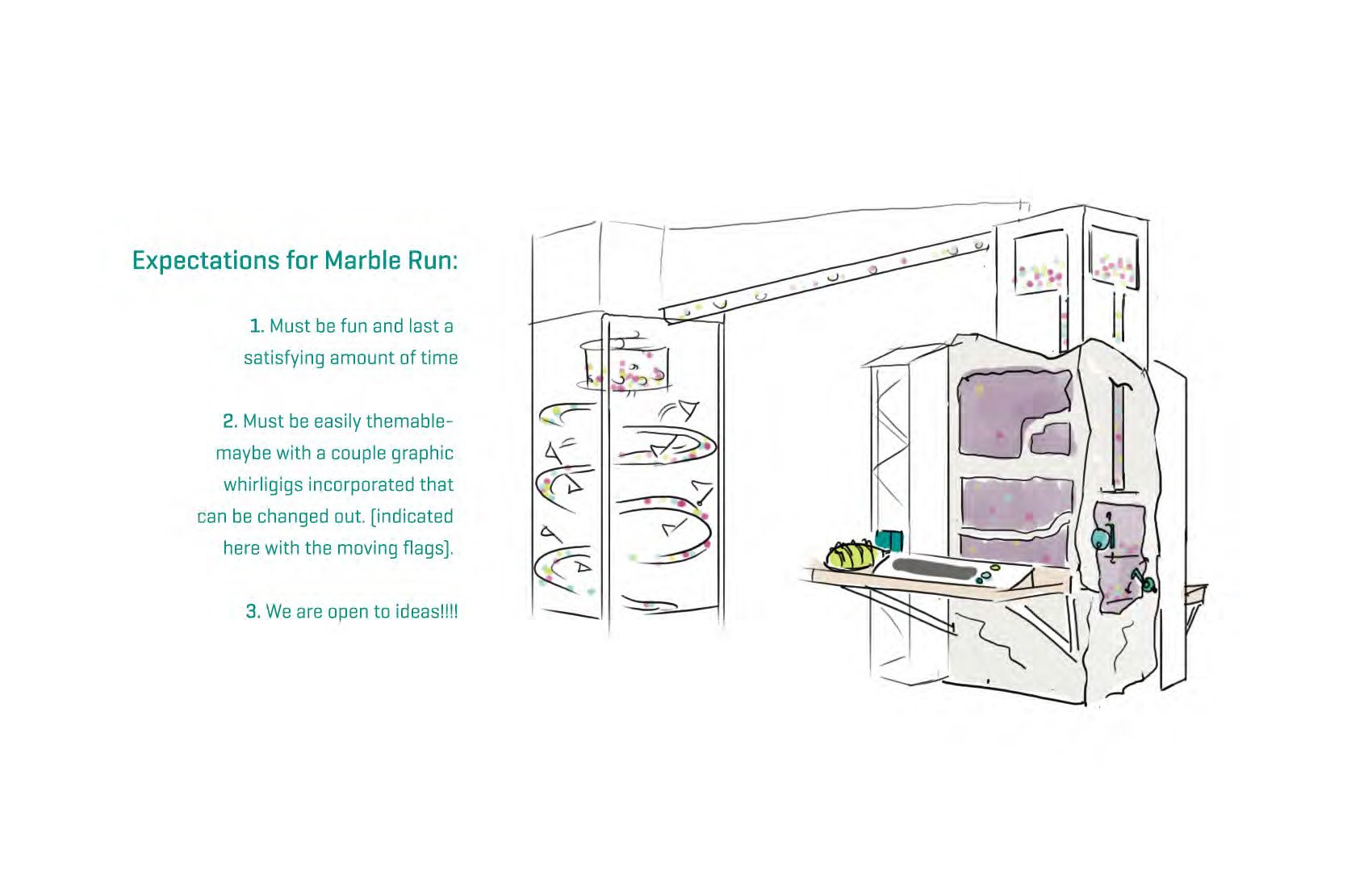
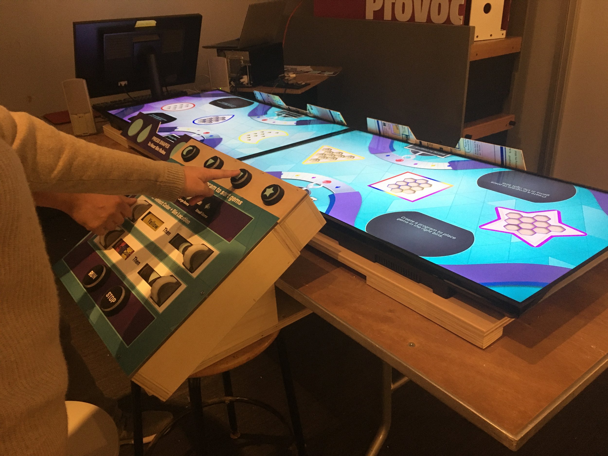
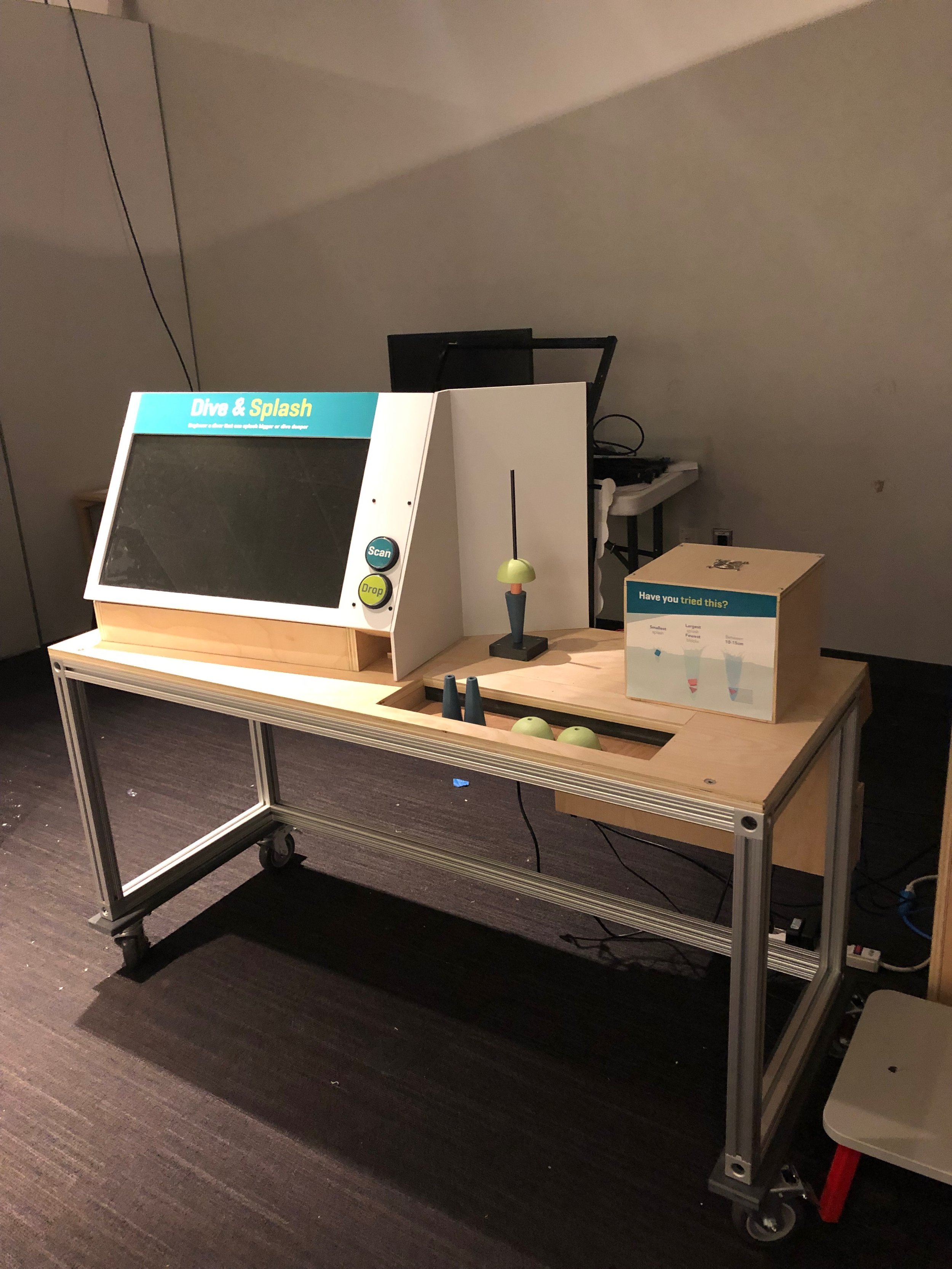
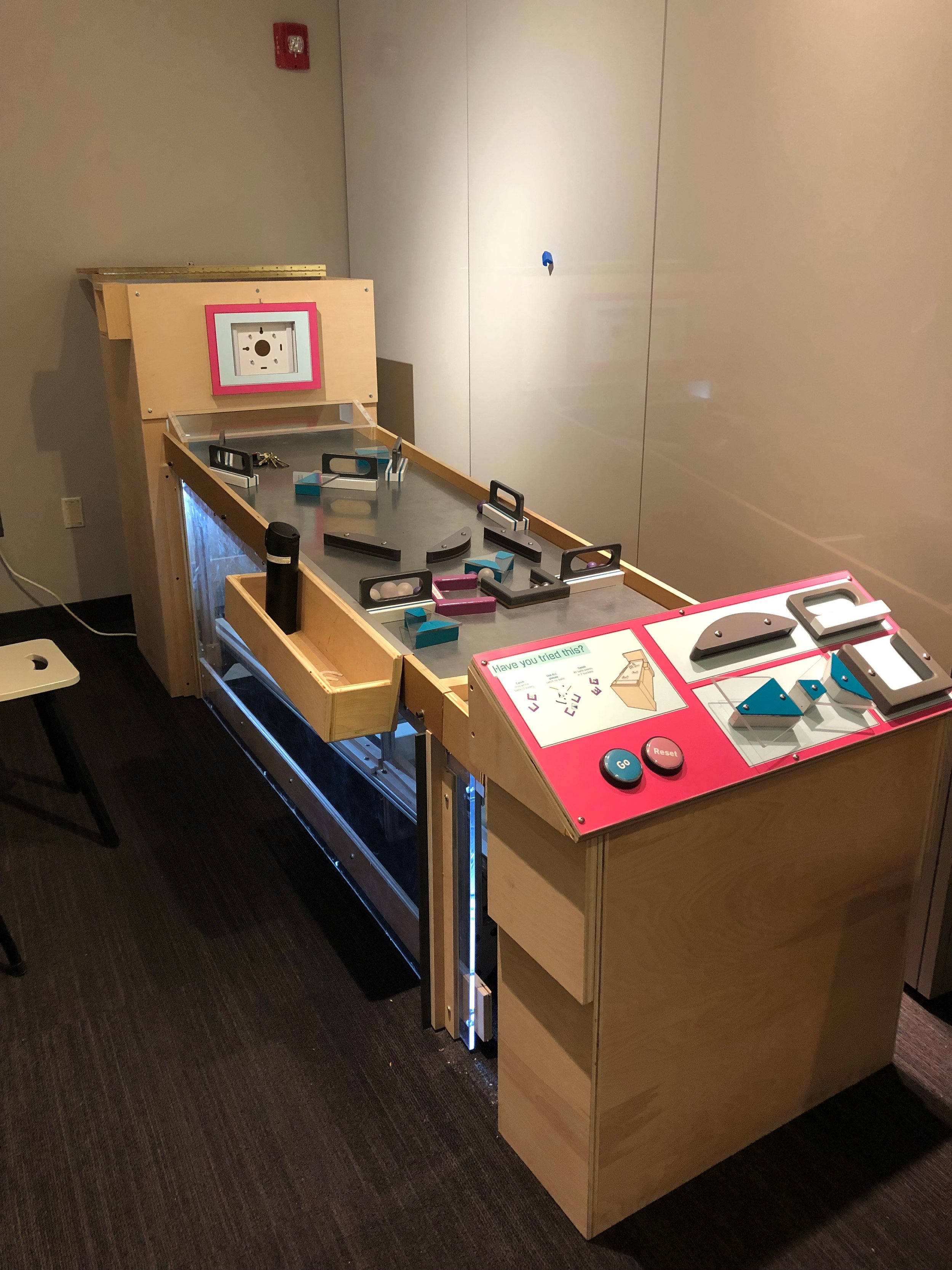
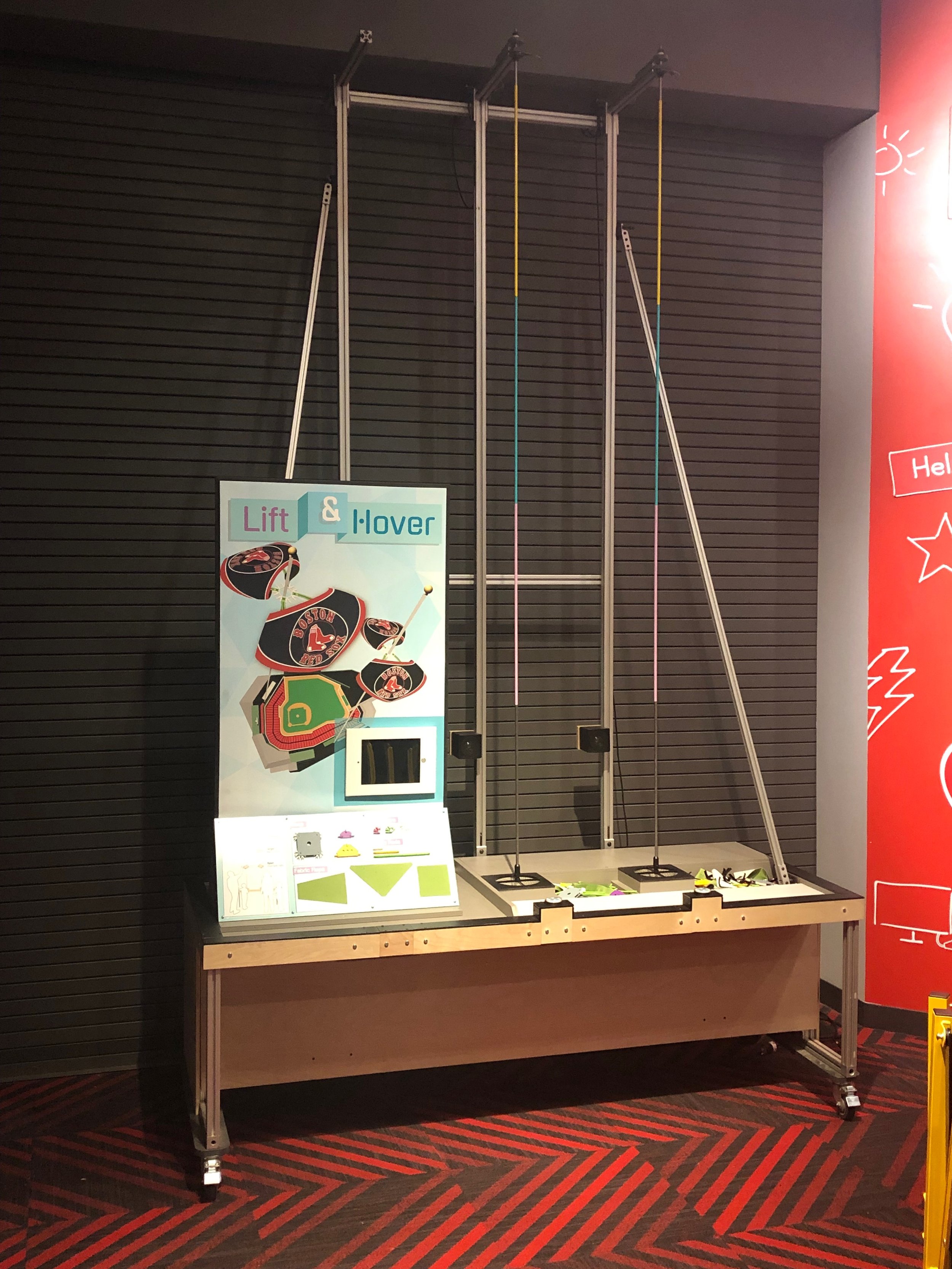
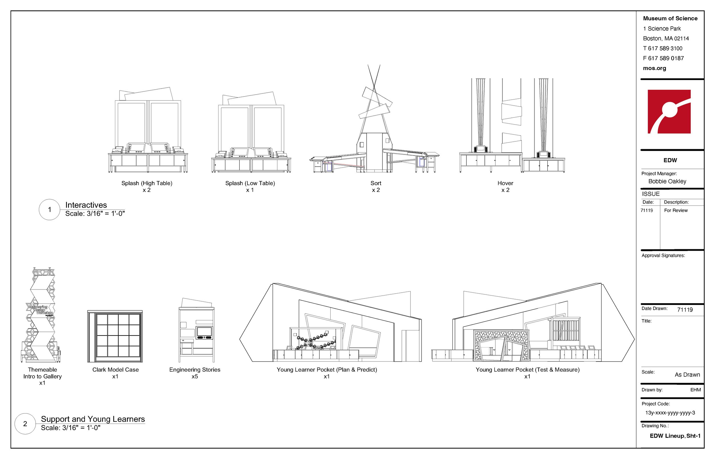
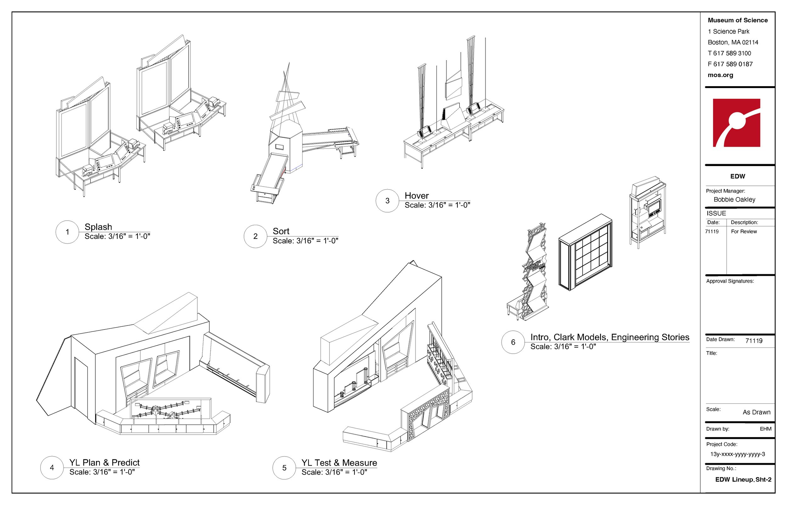
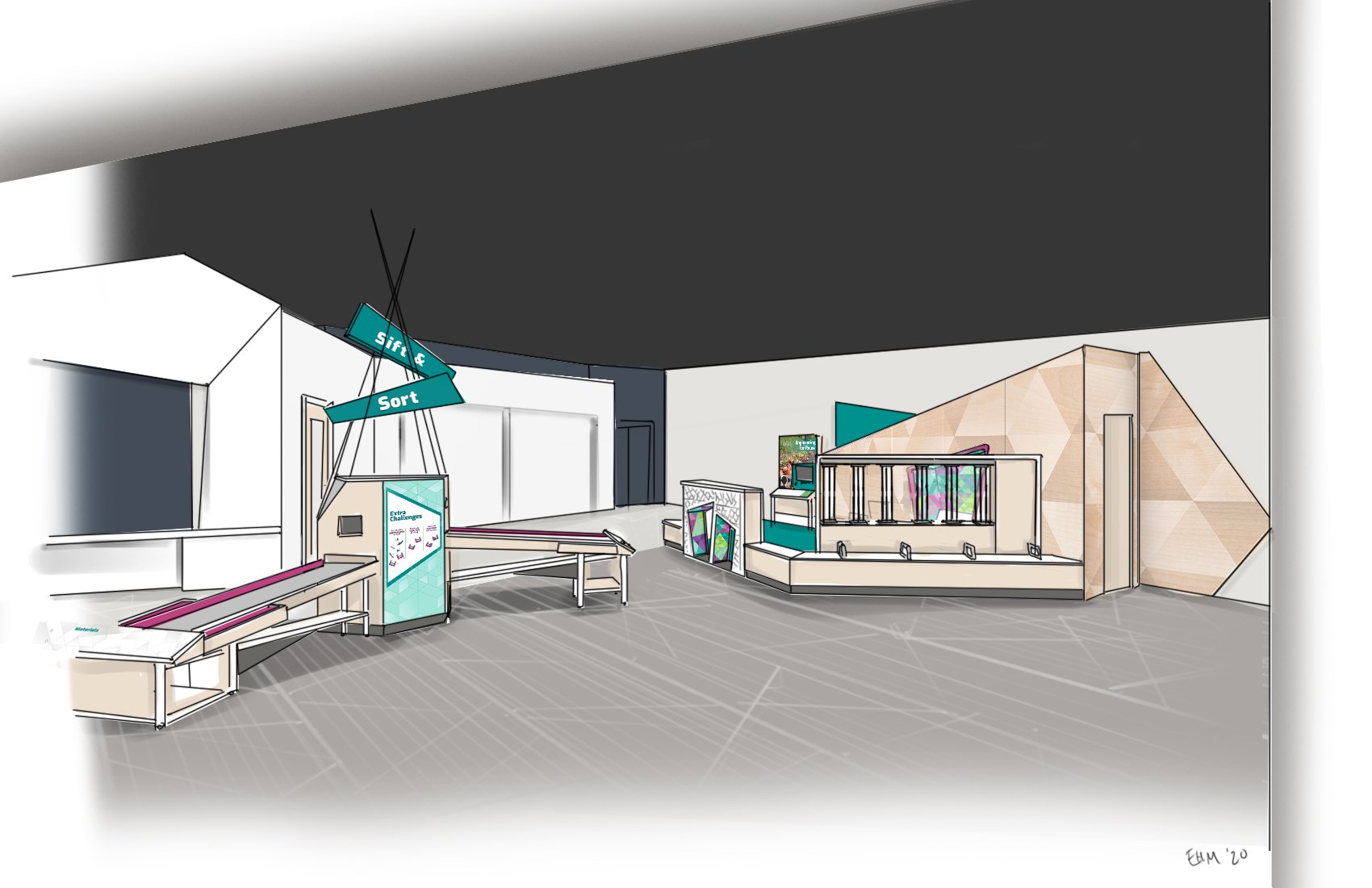
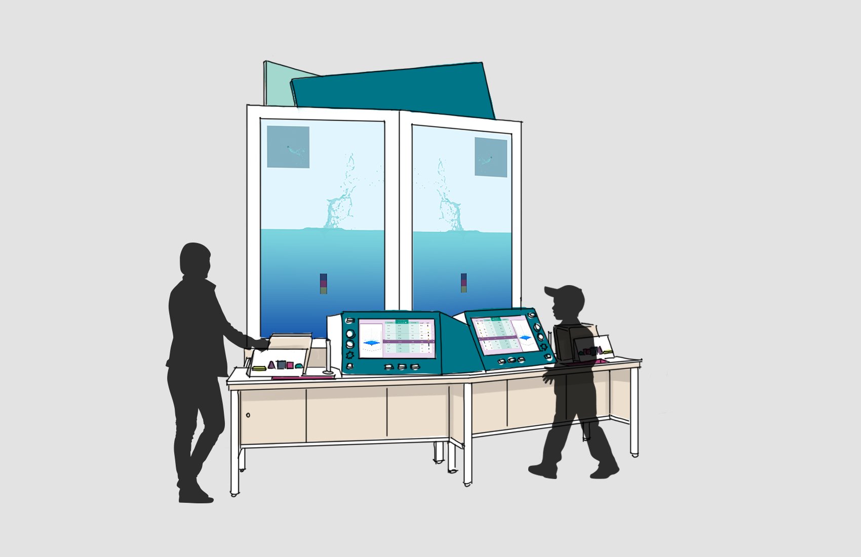
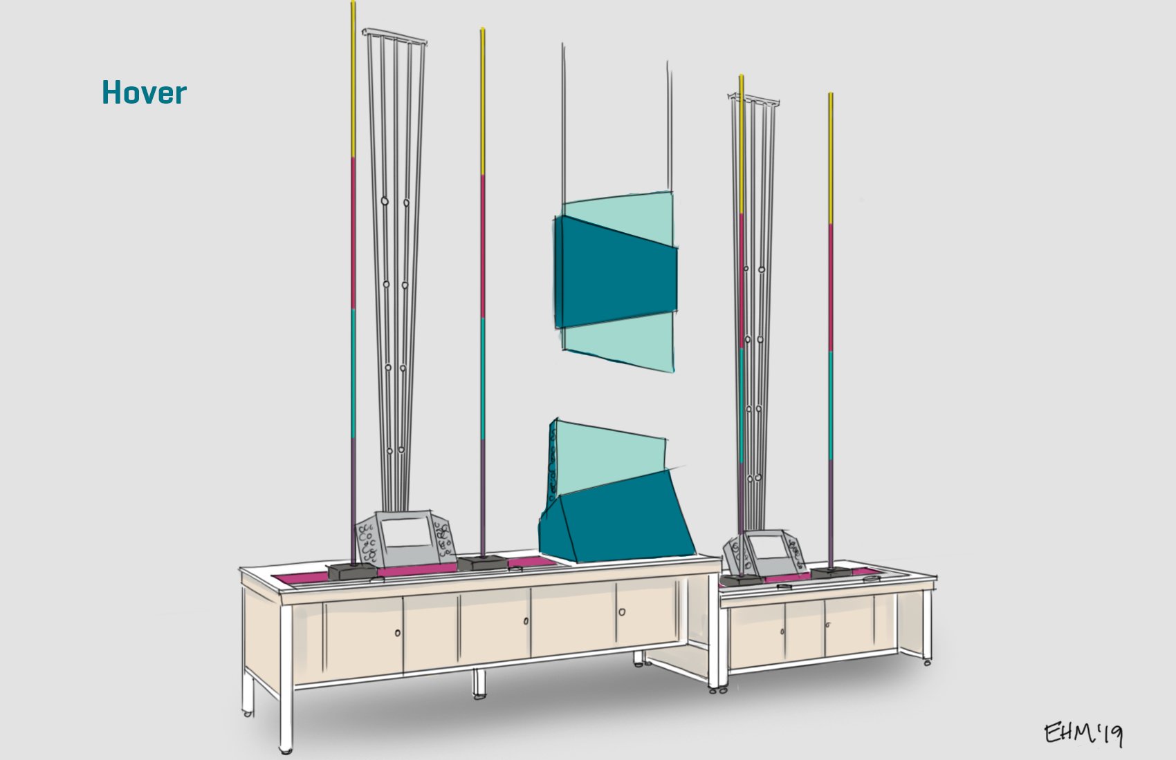
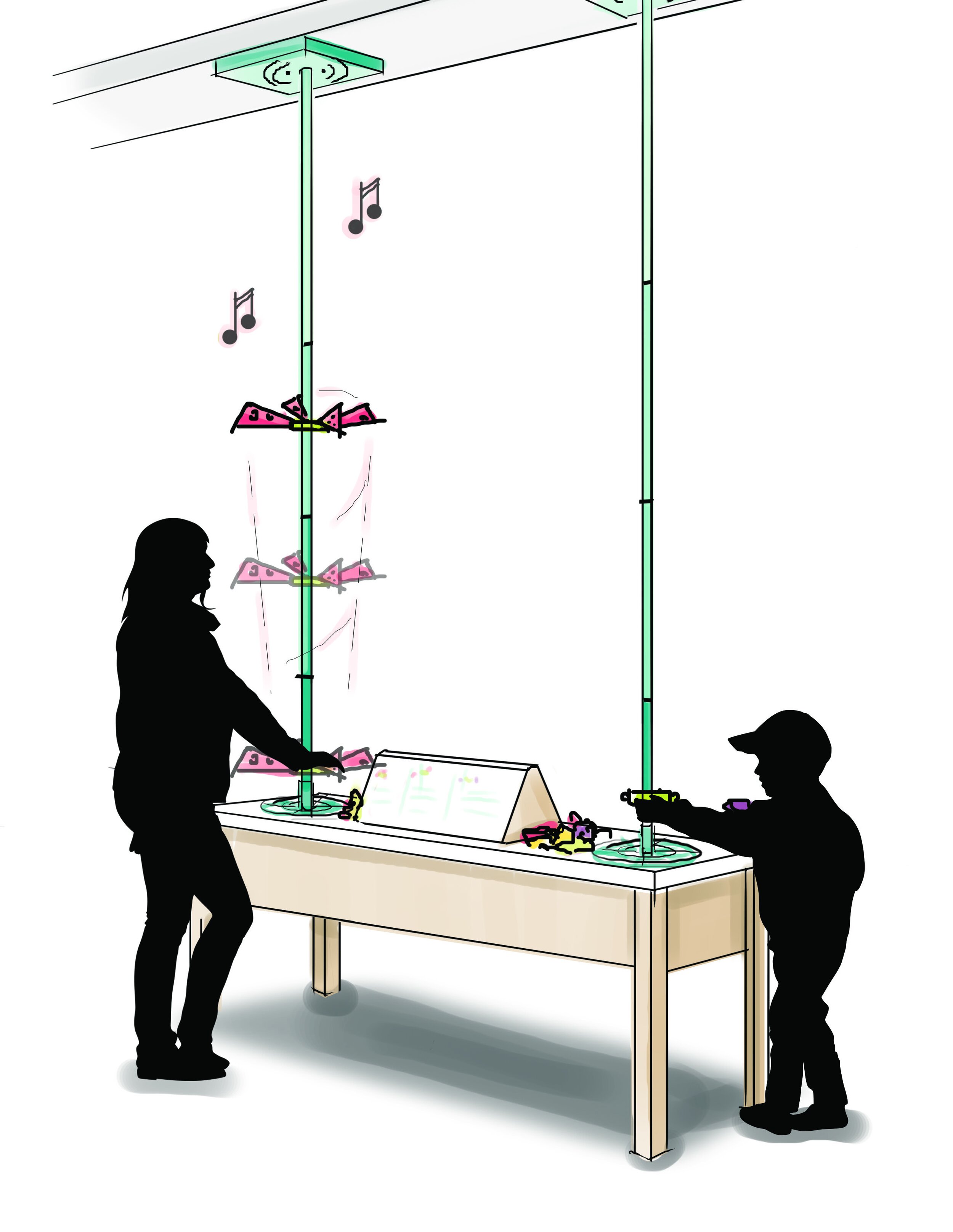
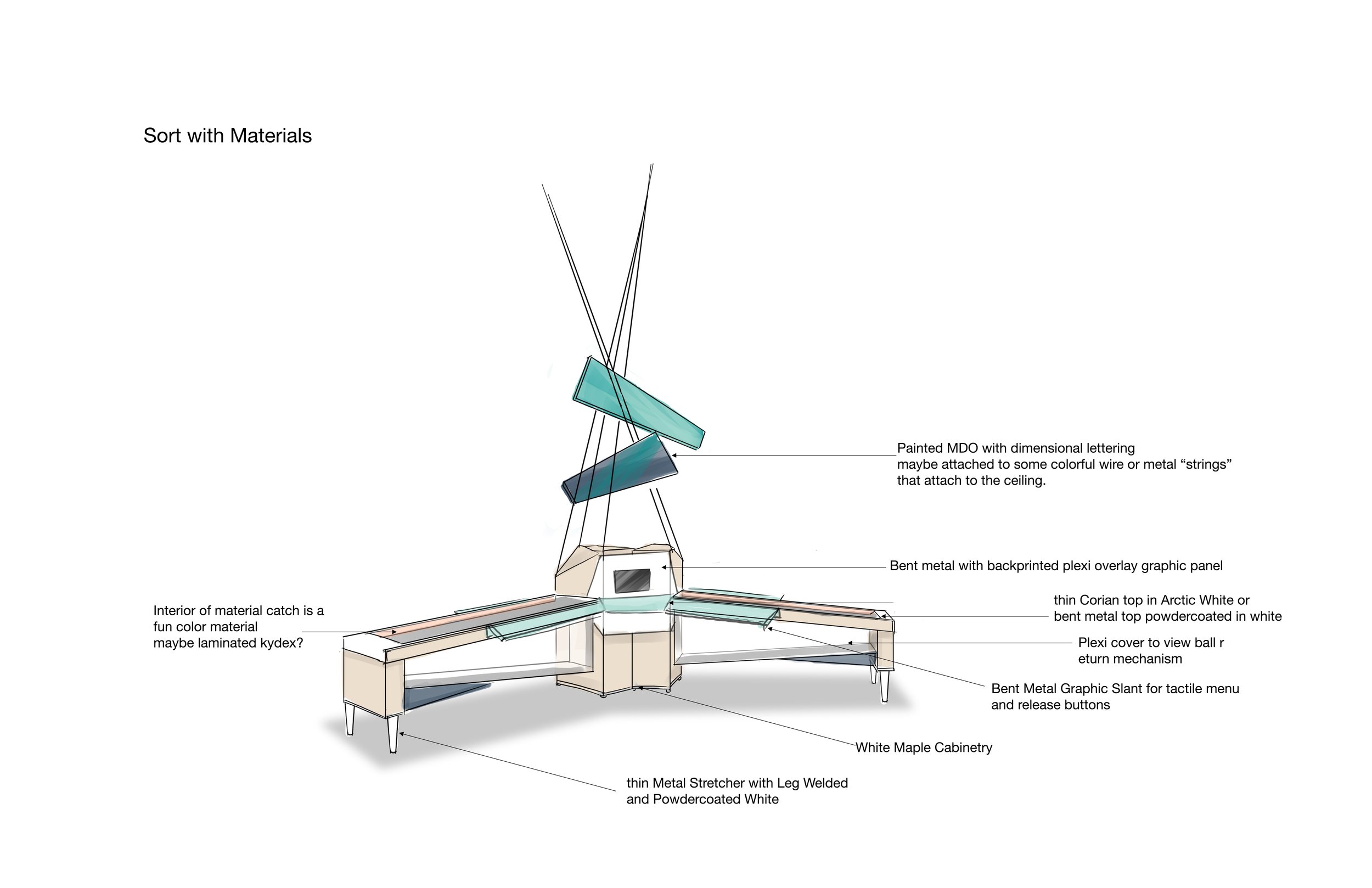
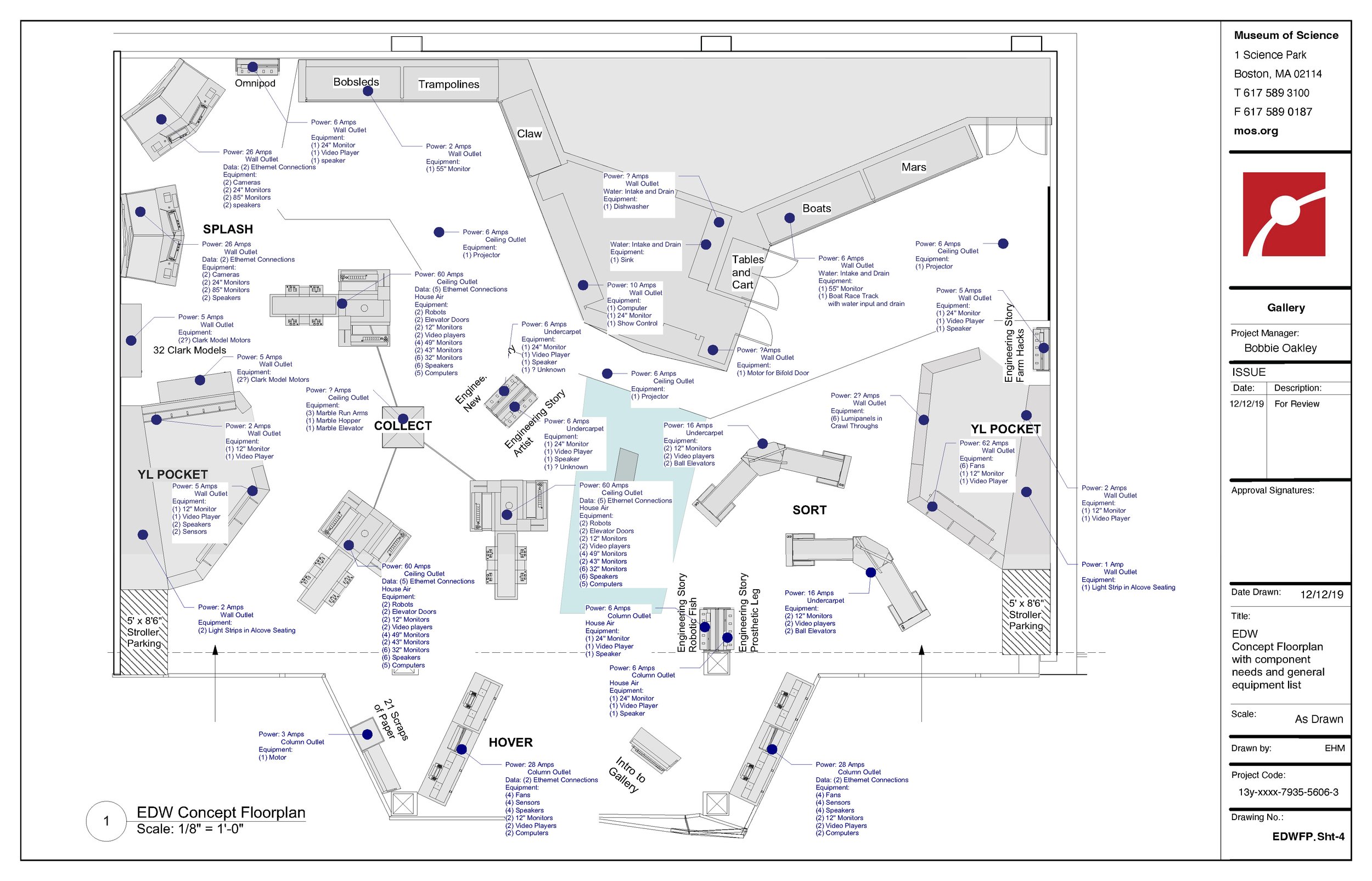
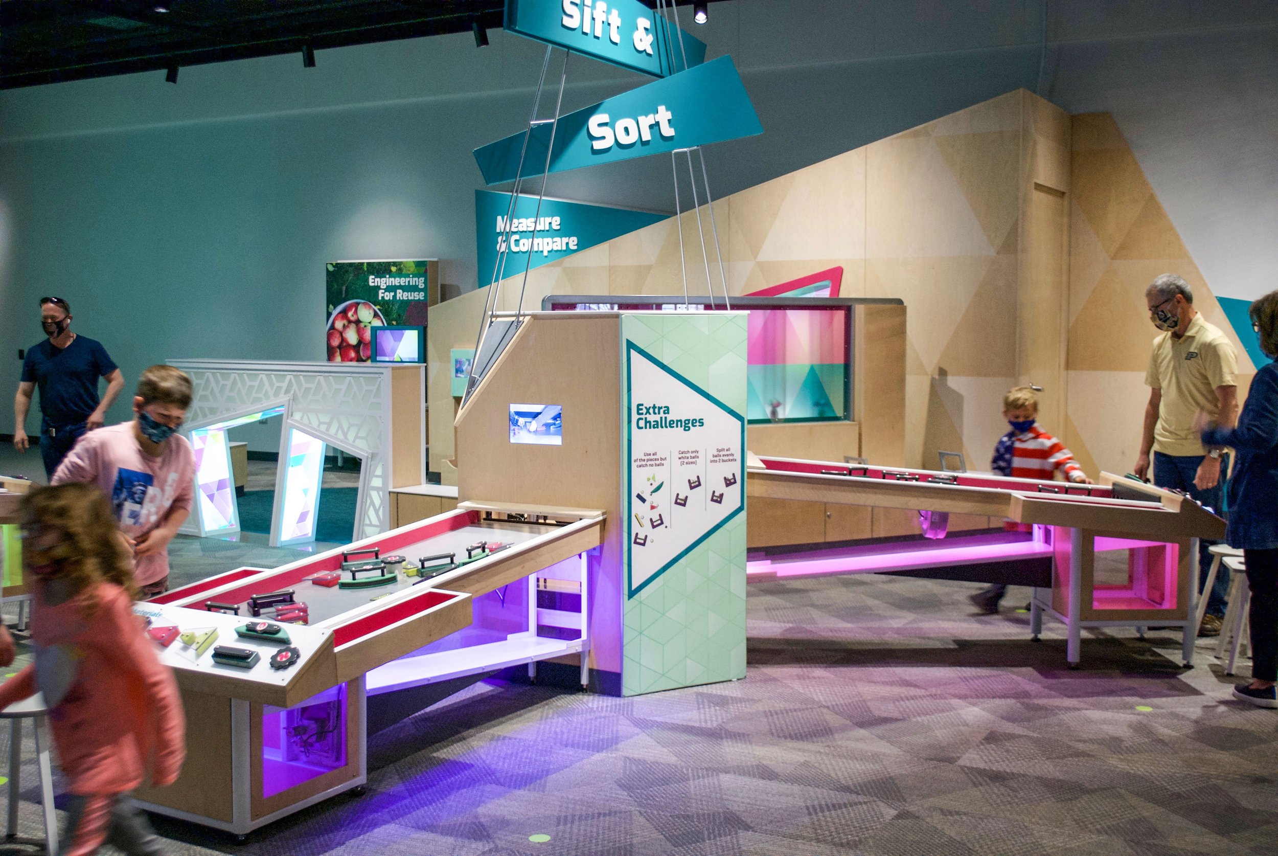
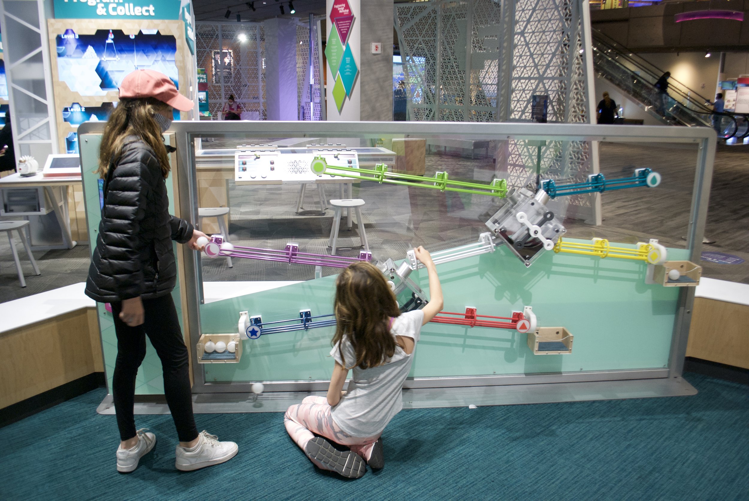
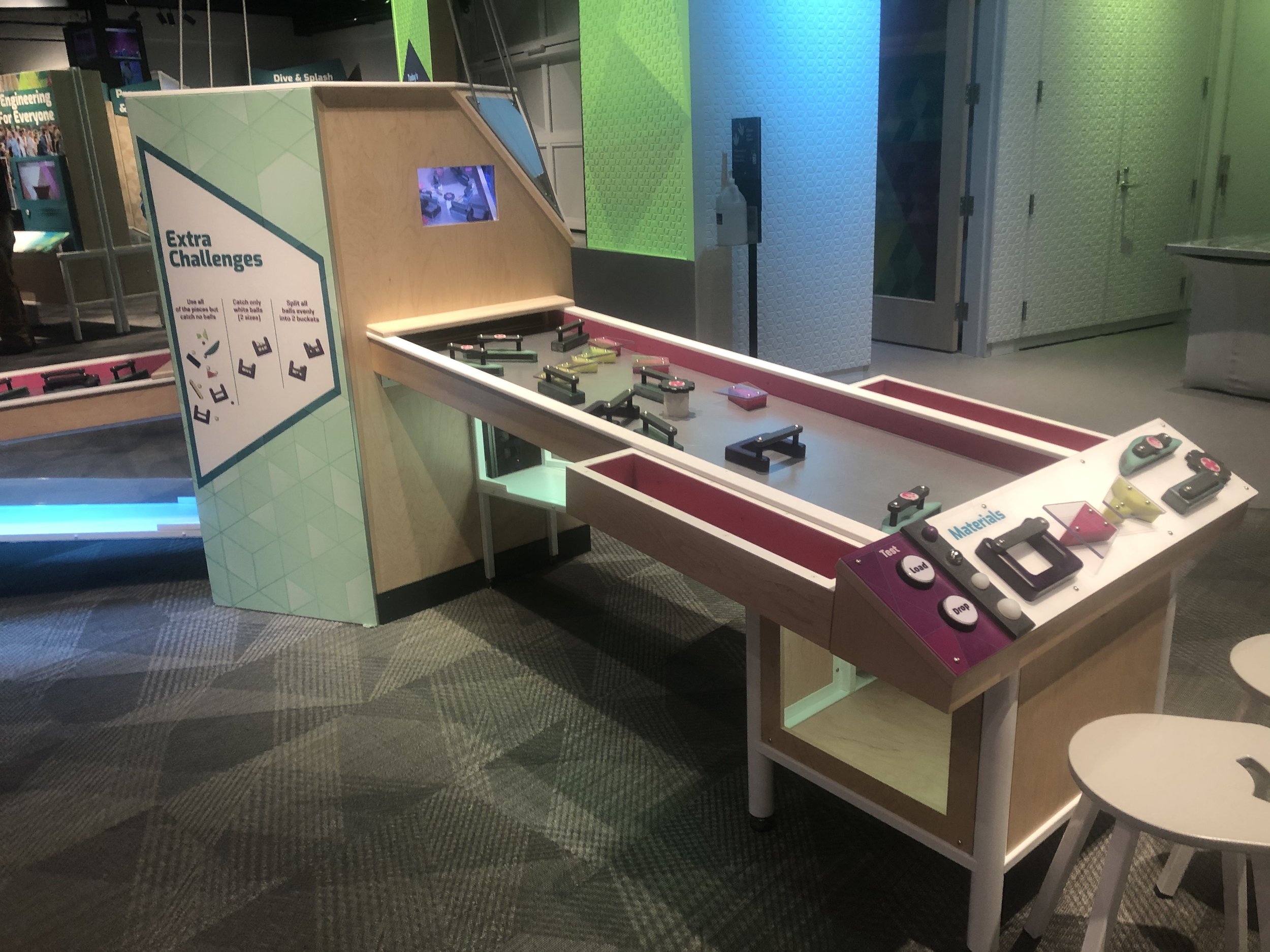
The development of this exhibit was so incredibly difficult. Our challenge was come up with activities that were authentic skills used by engineers, no matter their discipline, that were topic-neutral and that we could theme to match different events throughout the year. After months of struggle, we achieved our goal by beginning with an action word and a modifier. Like Splash: How high? Or Sort: How many [purple balls can you catch]? These stand-alone interactions surround an educator space that activates daily with similar engineering challenges.
The Gallery
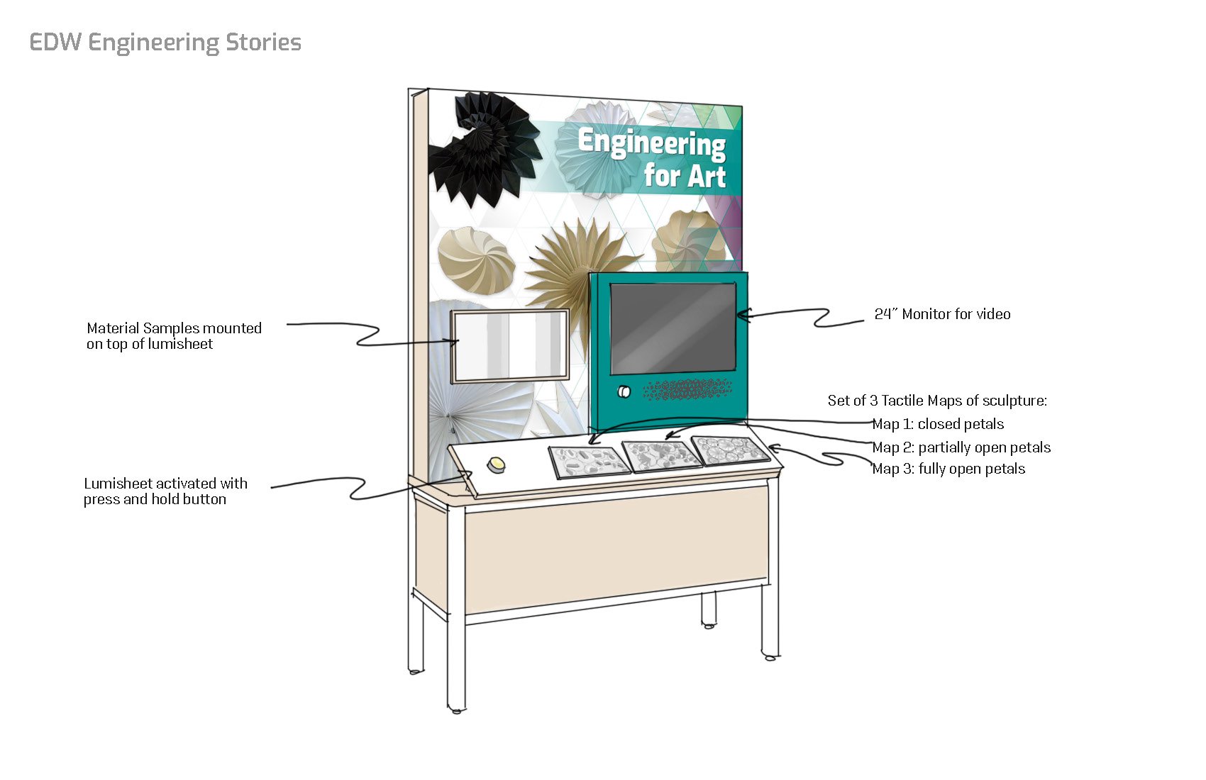
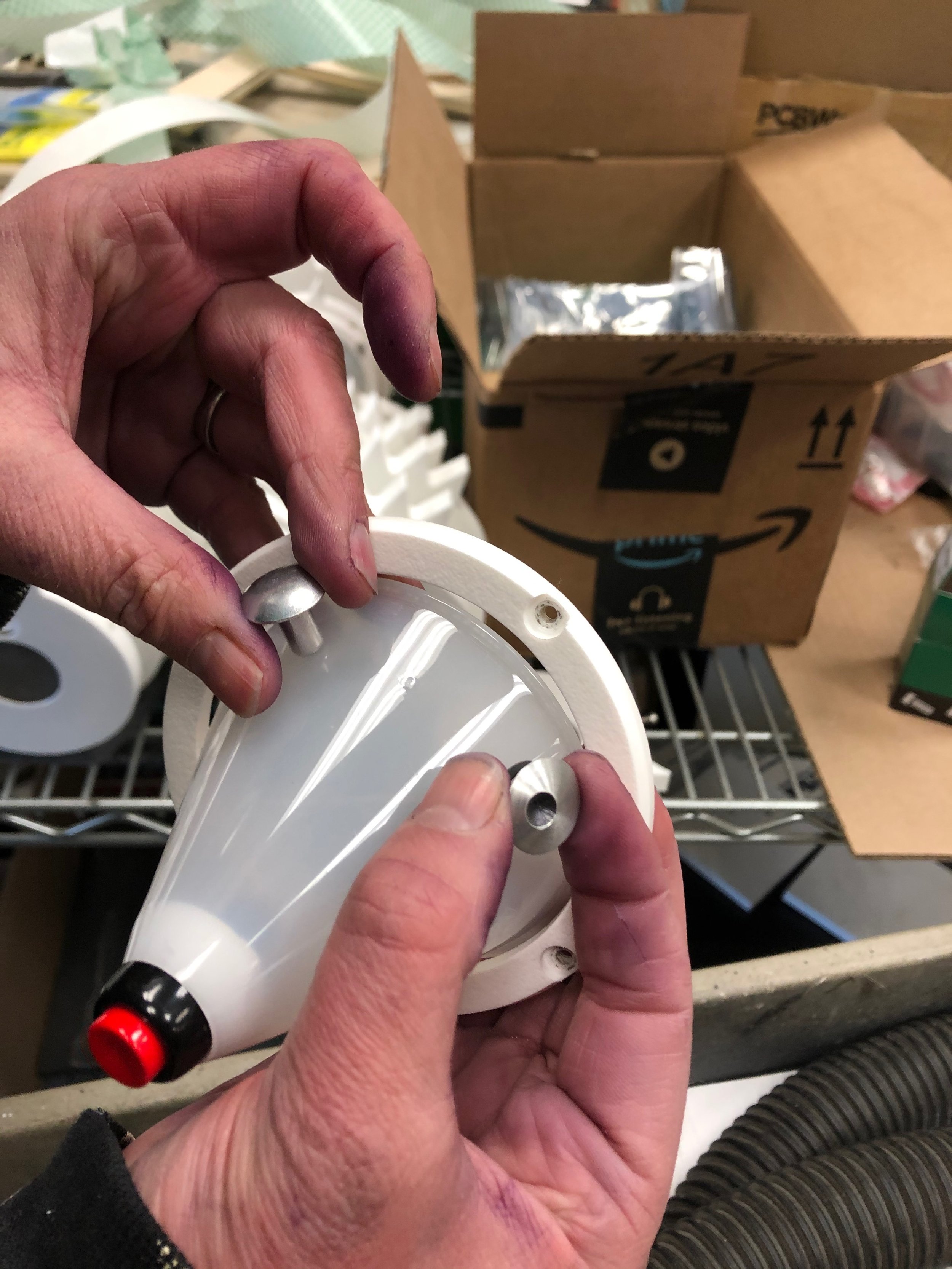
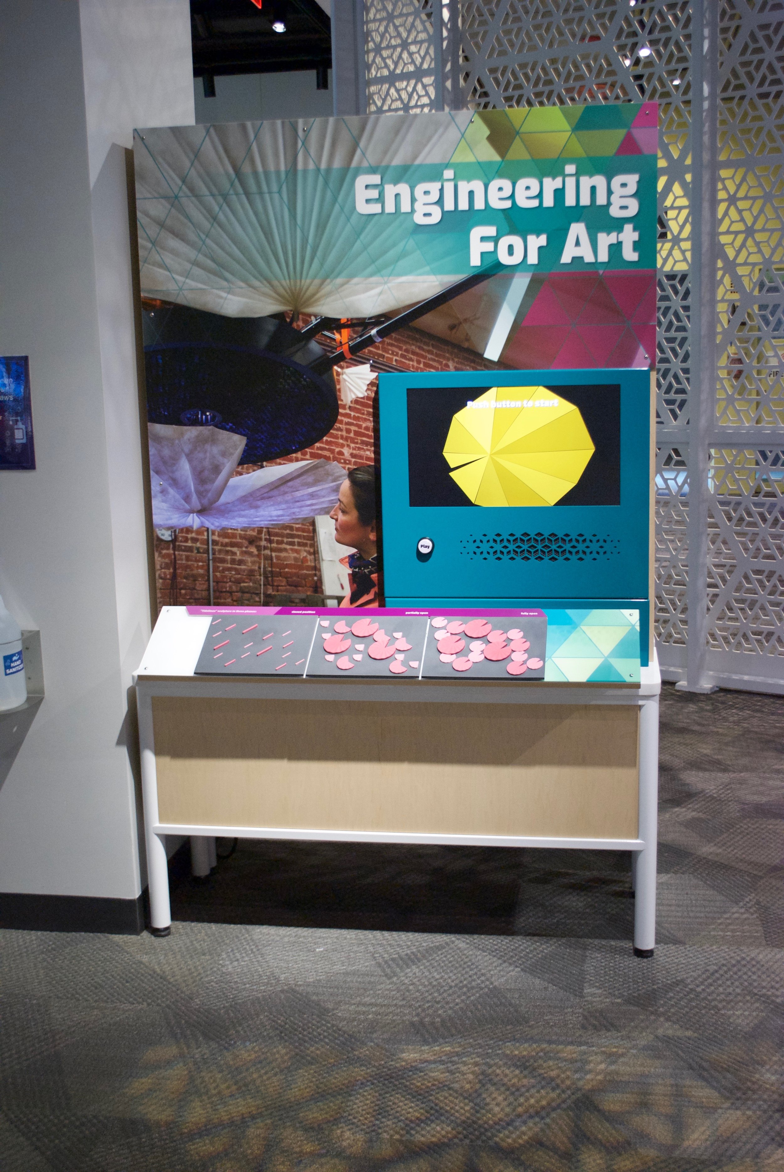
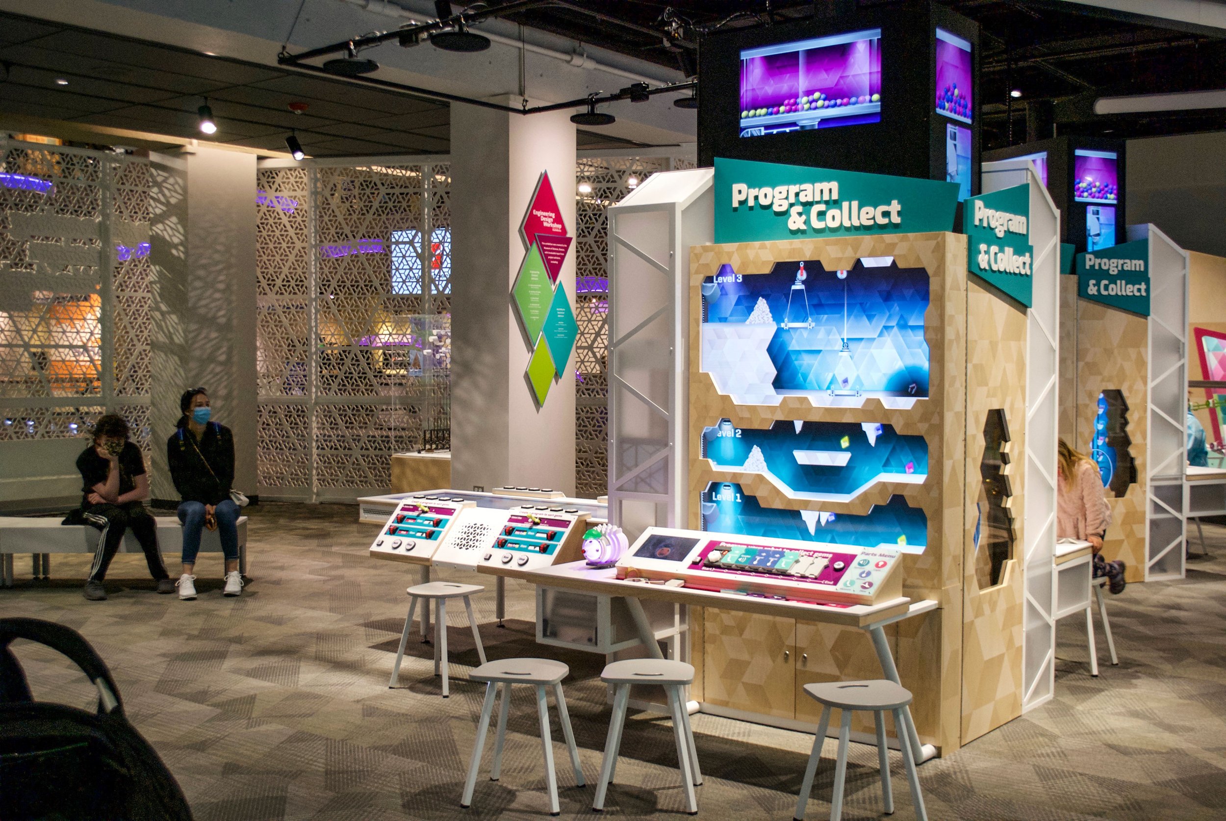
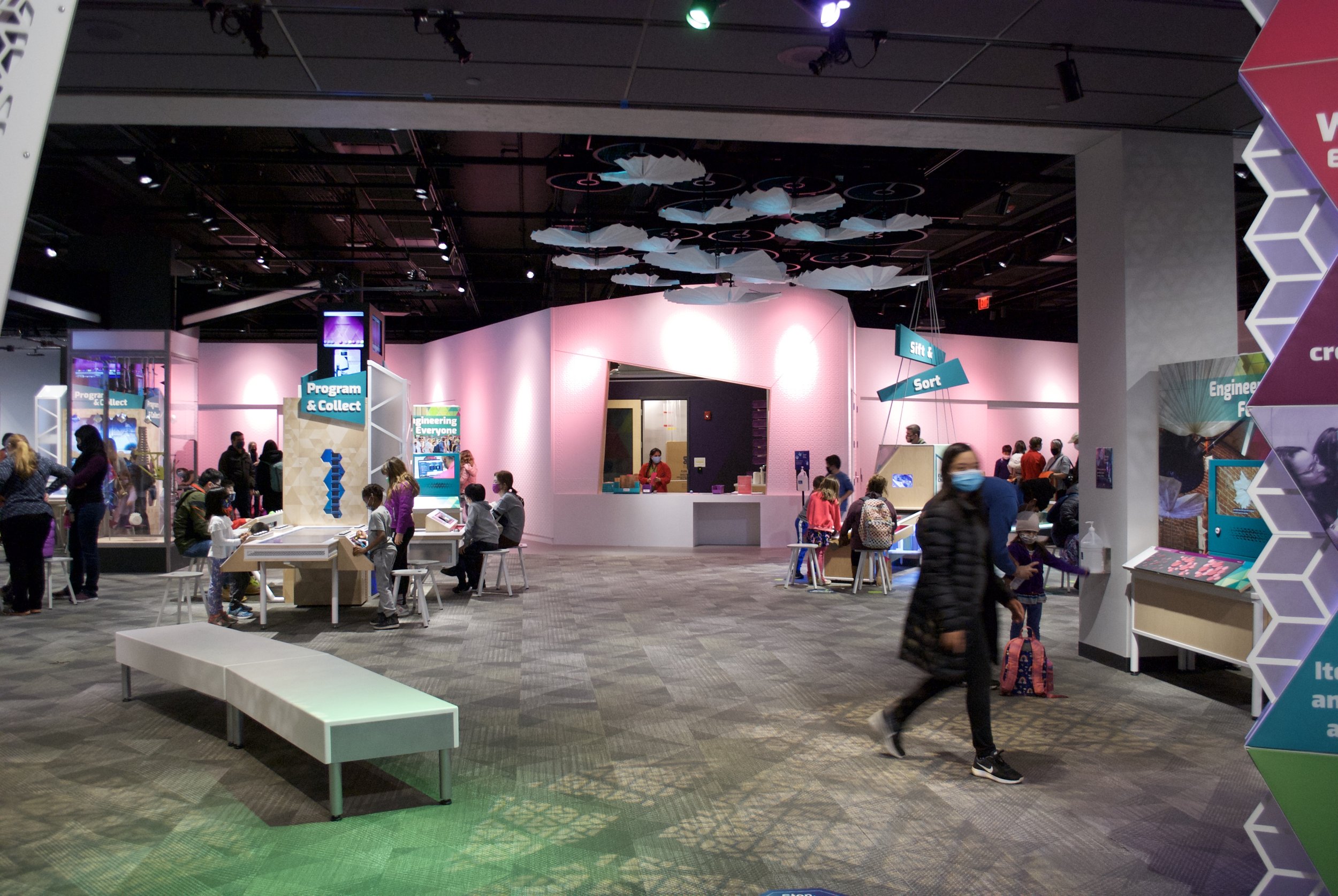
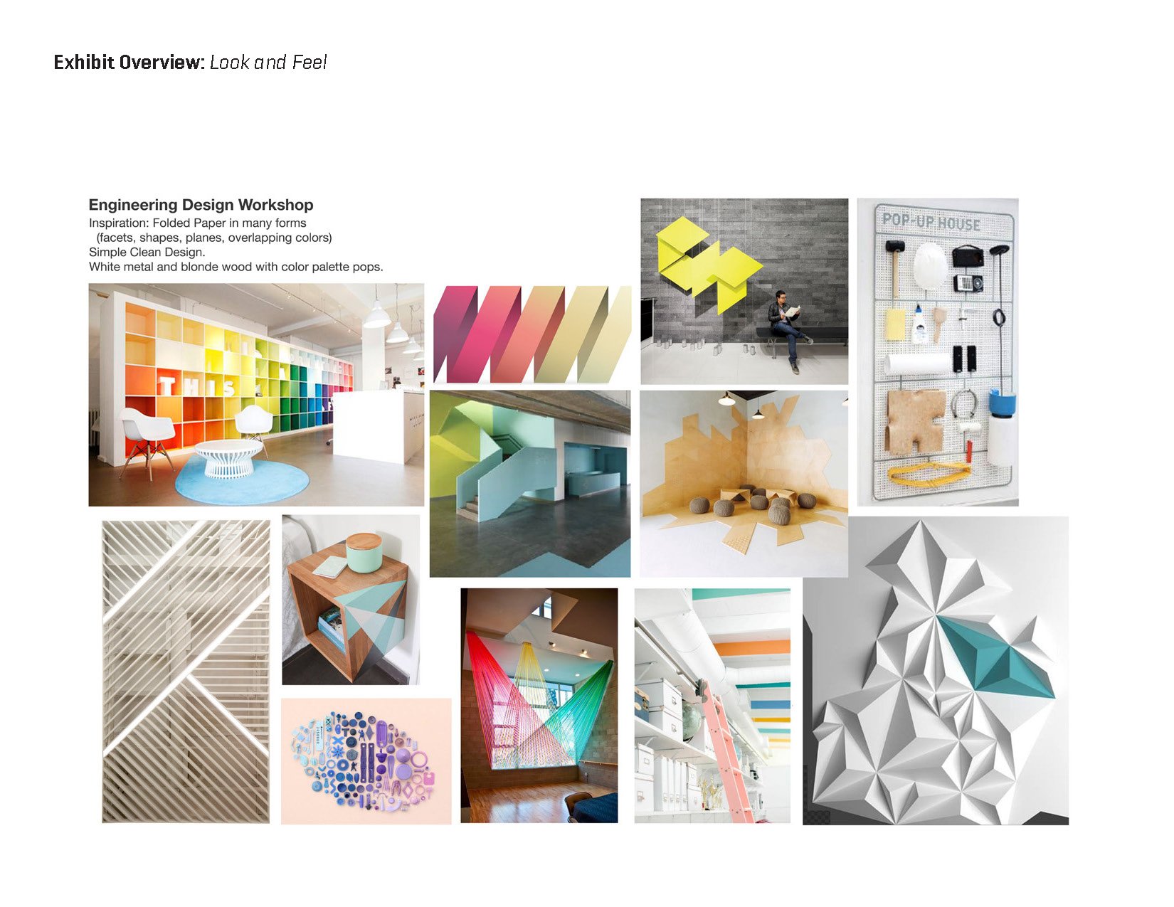
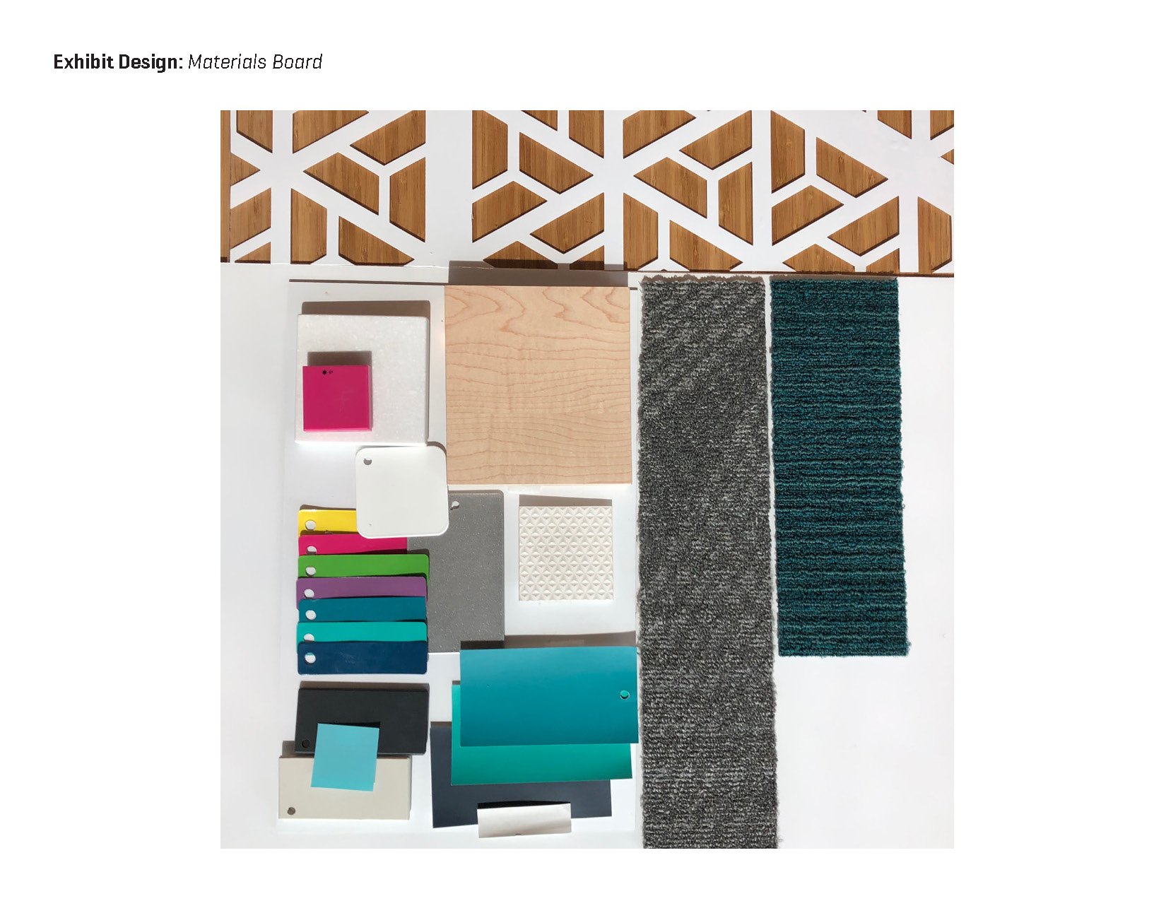
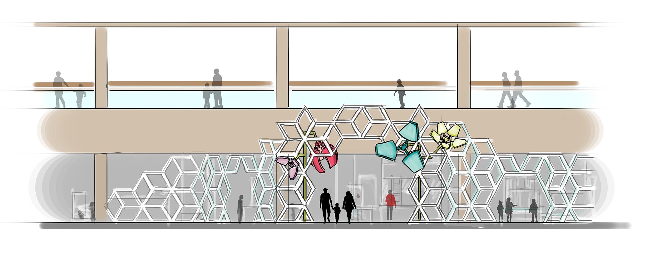
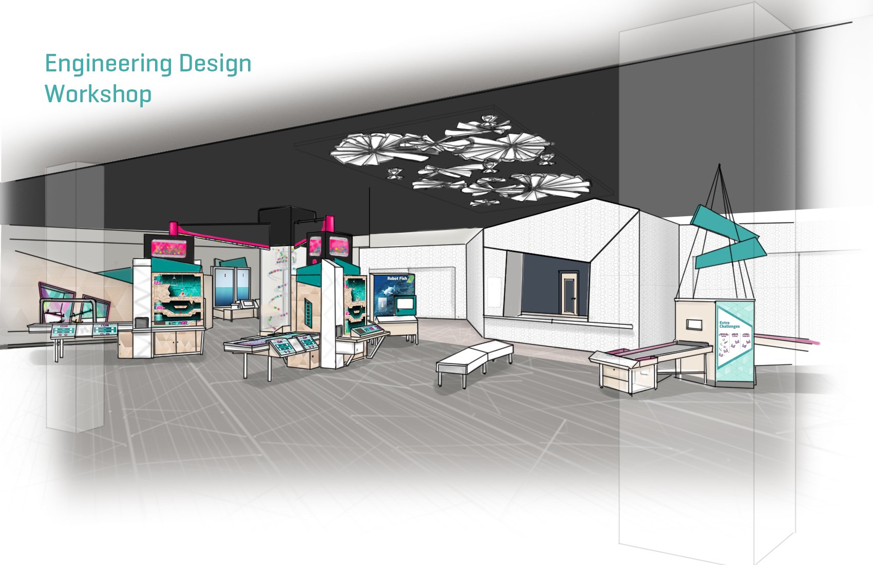
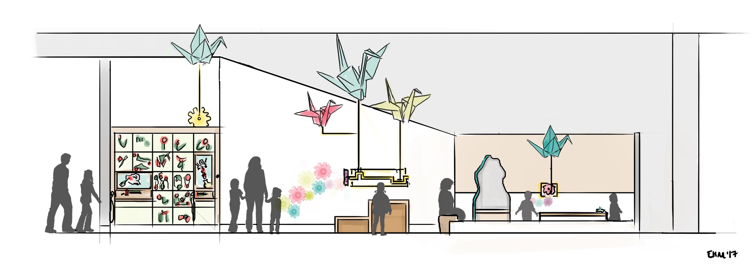
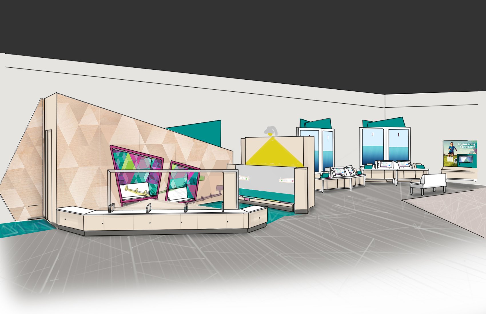
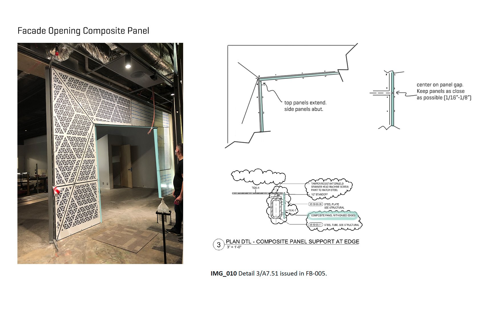
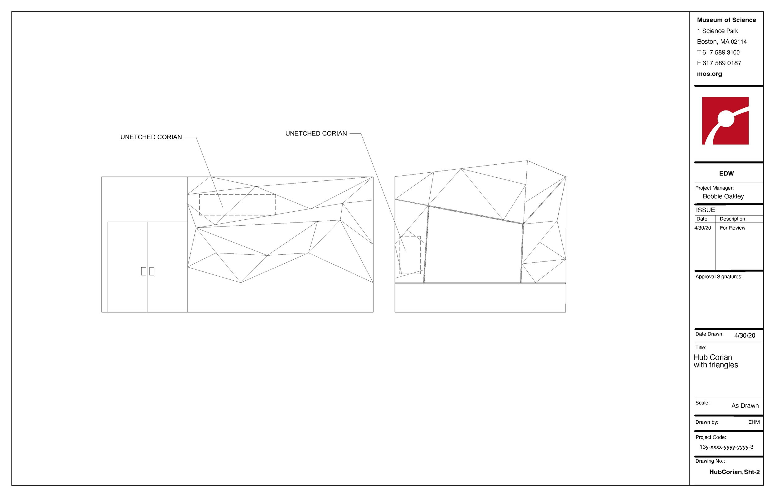
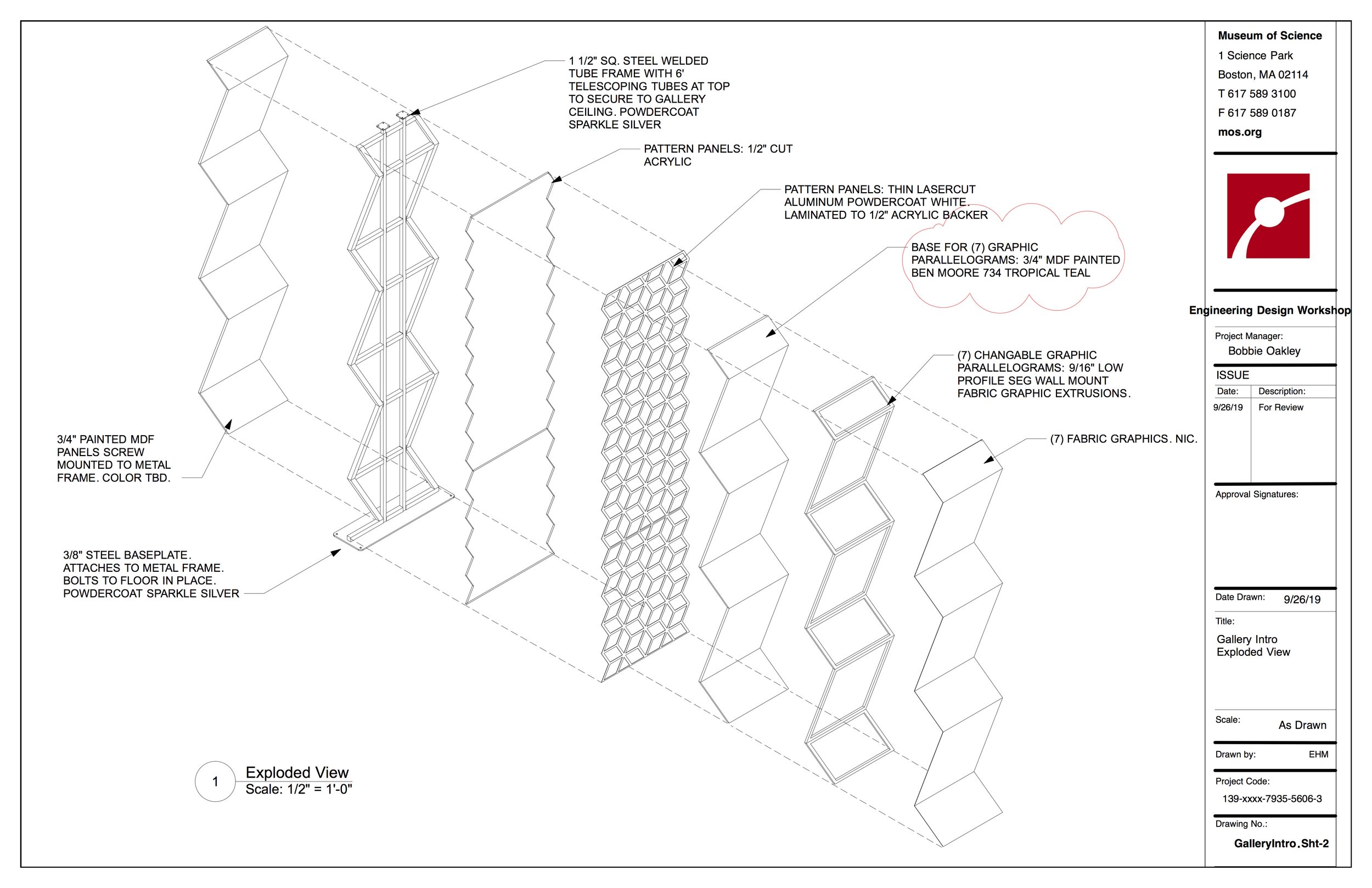
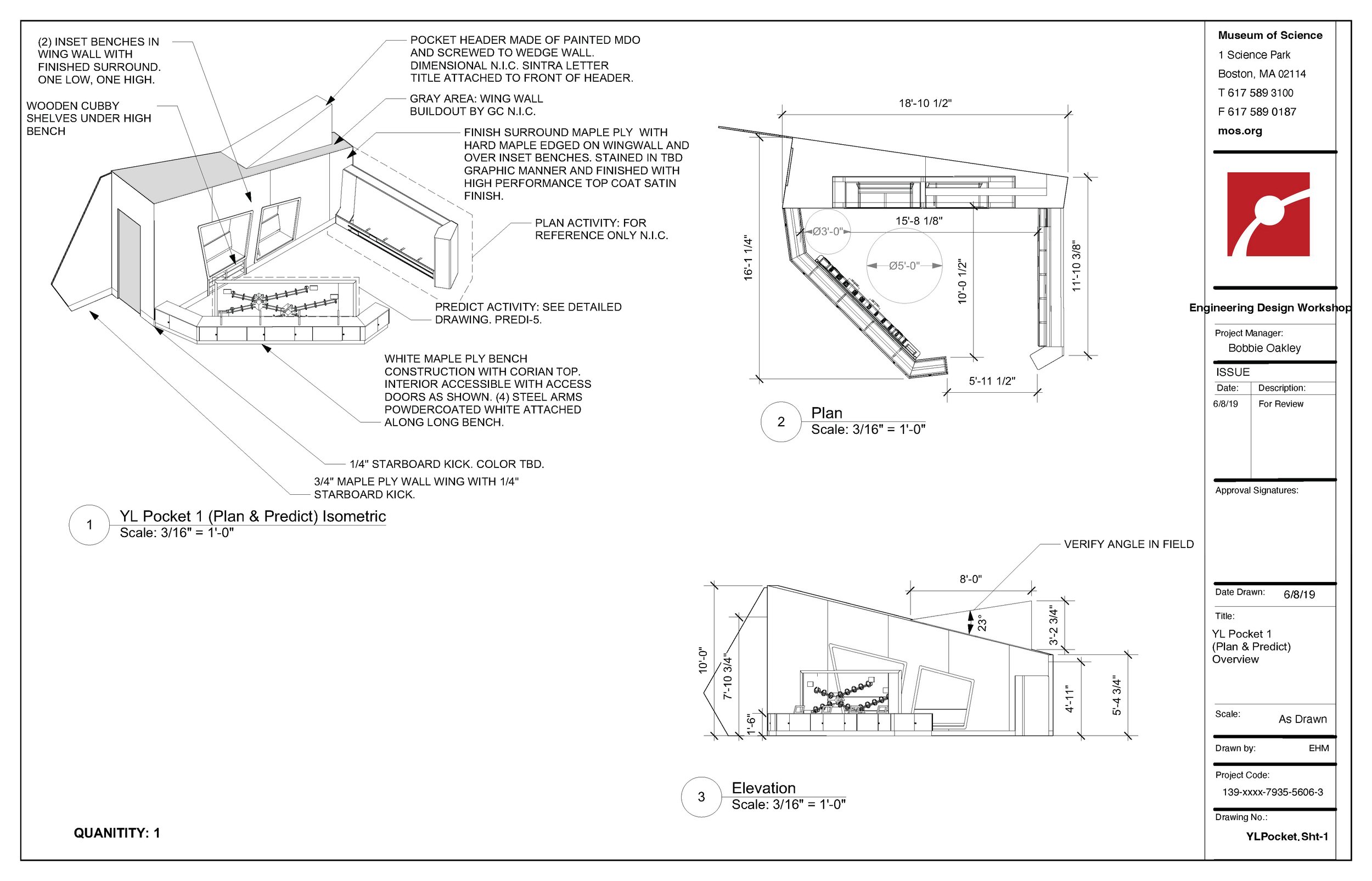
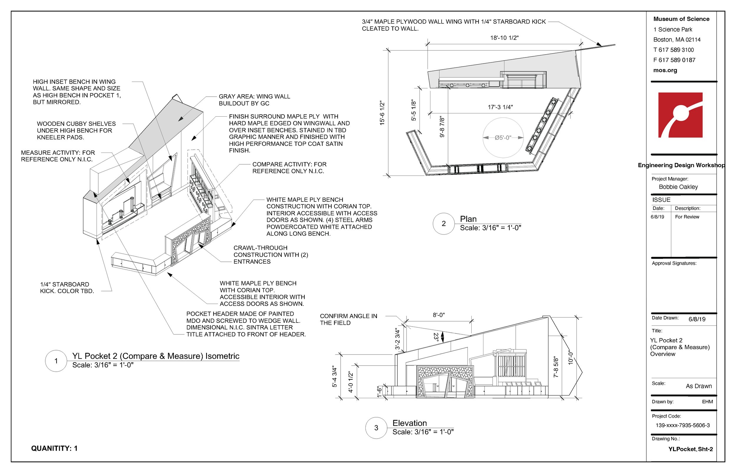
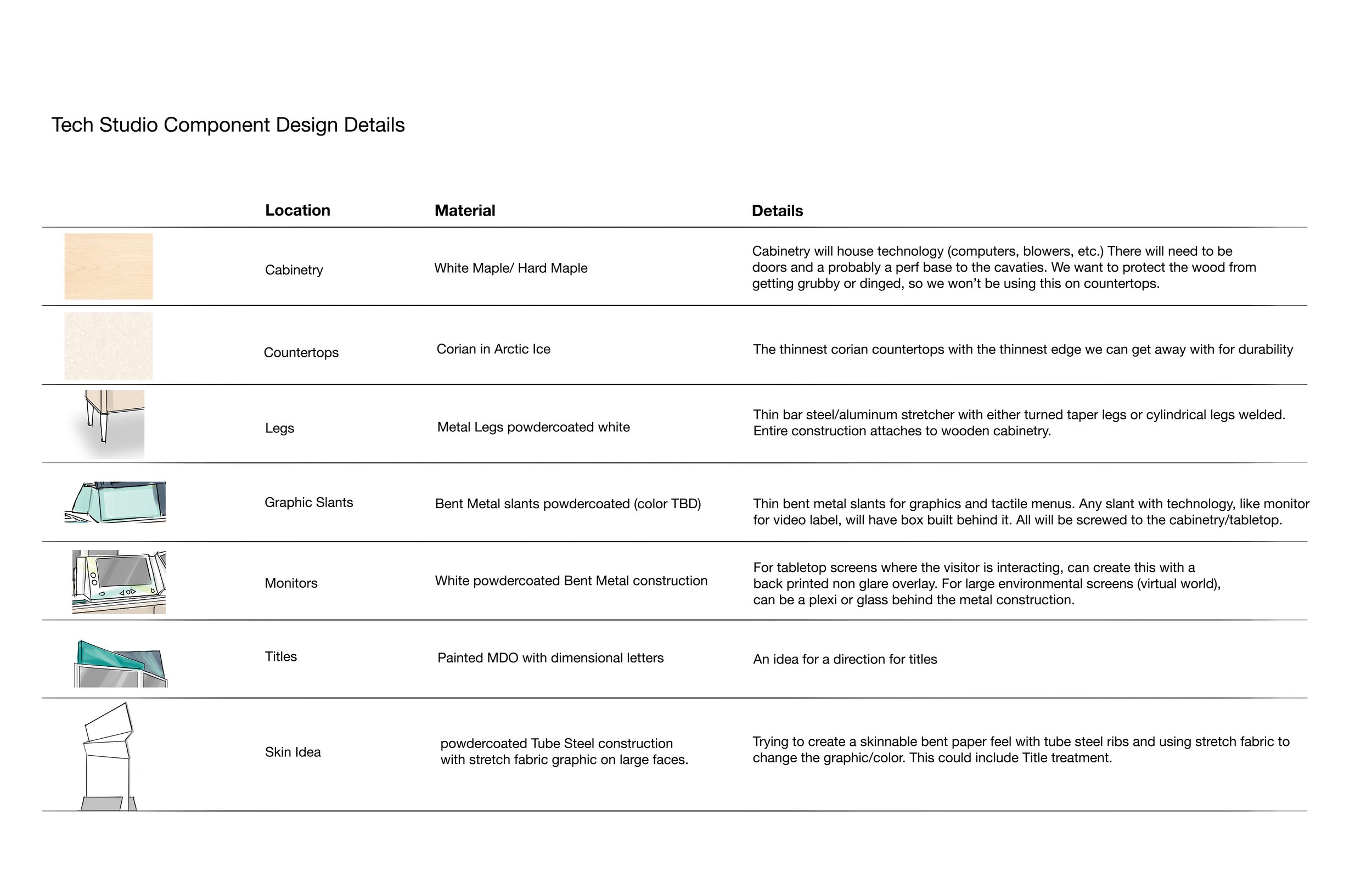
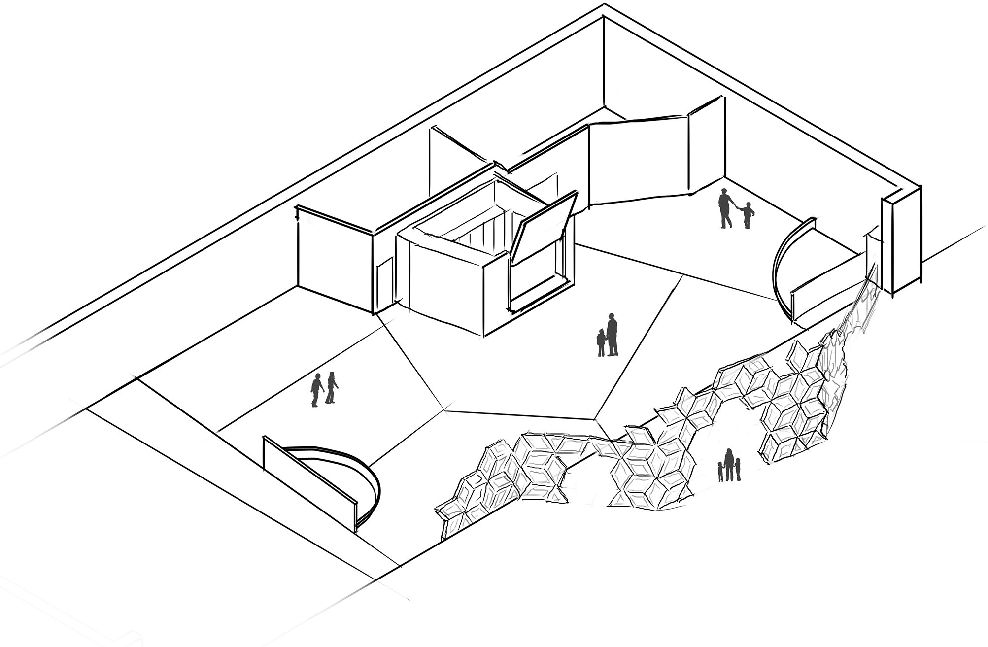
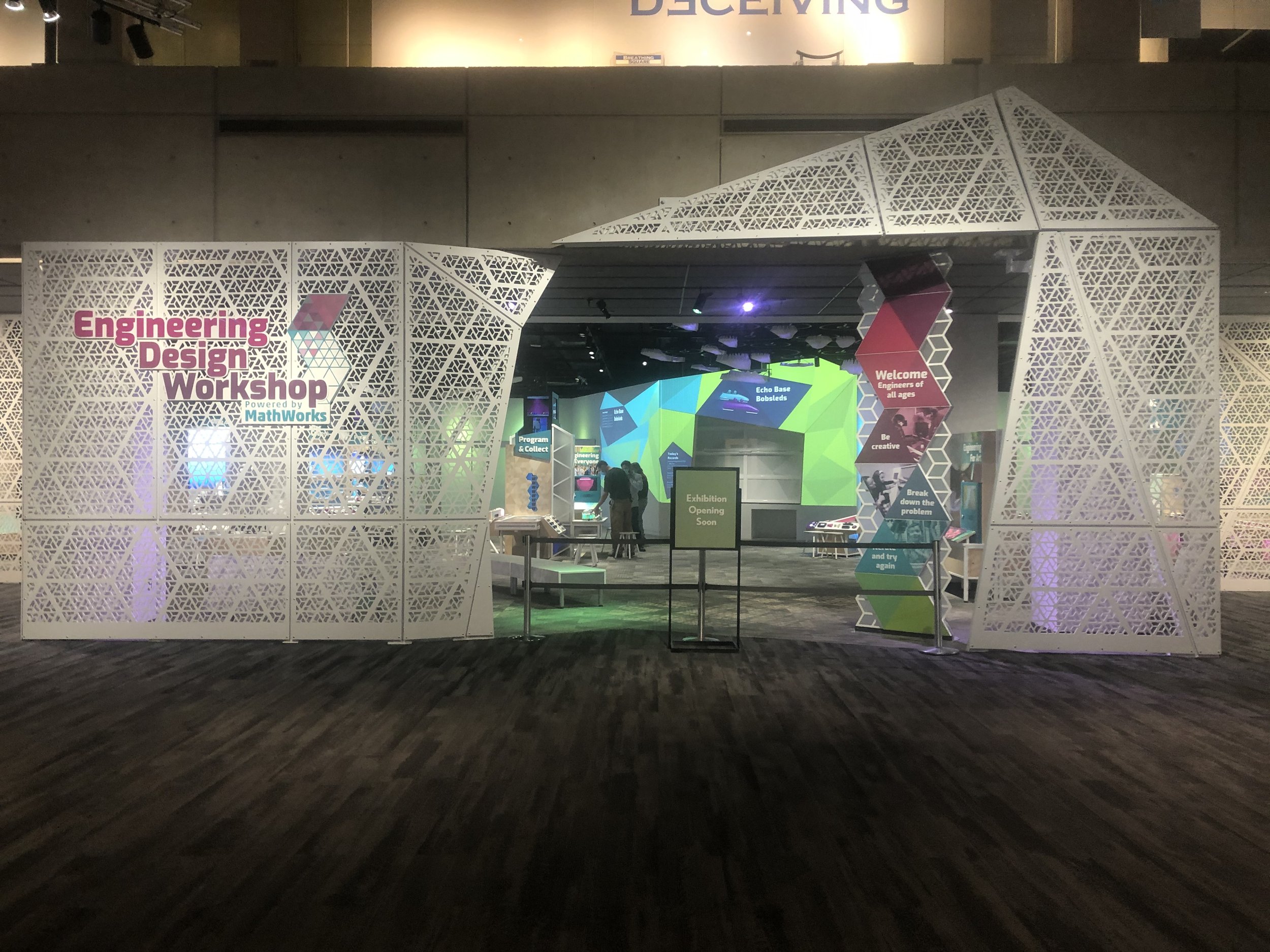
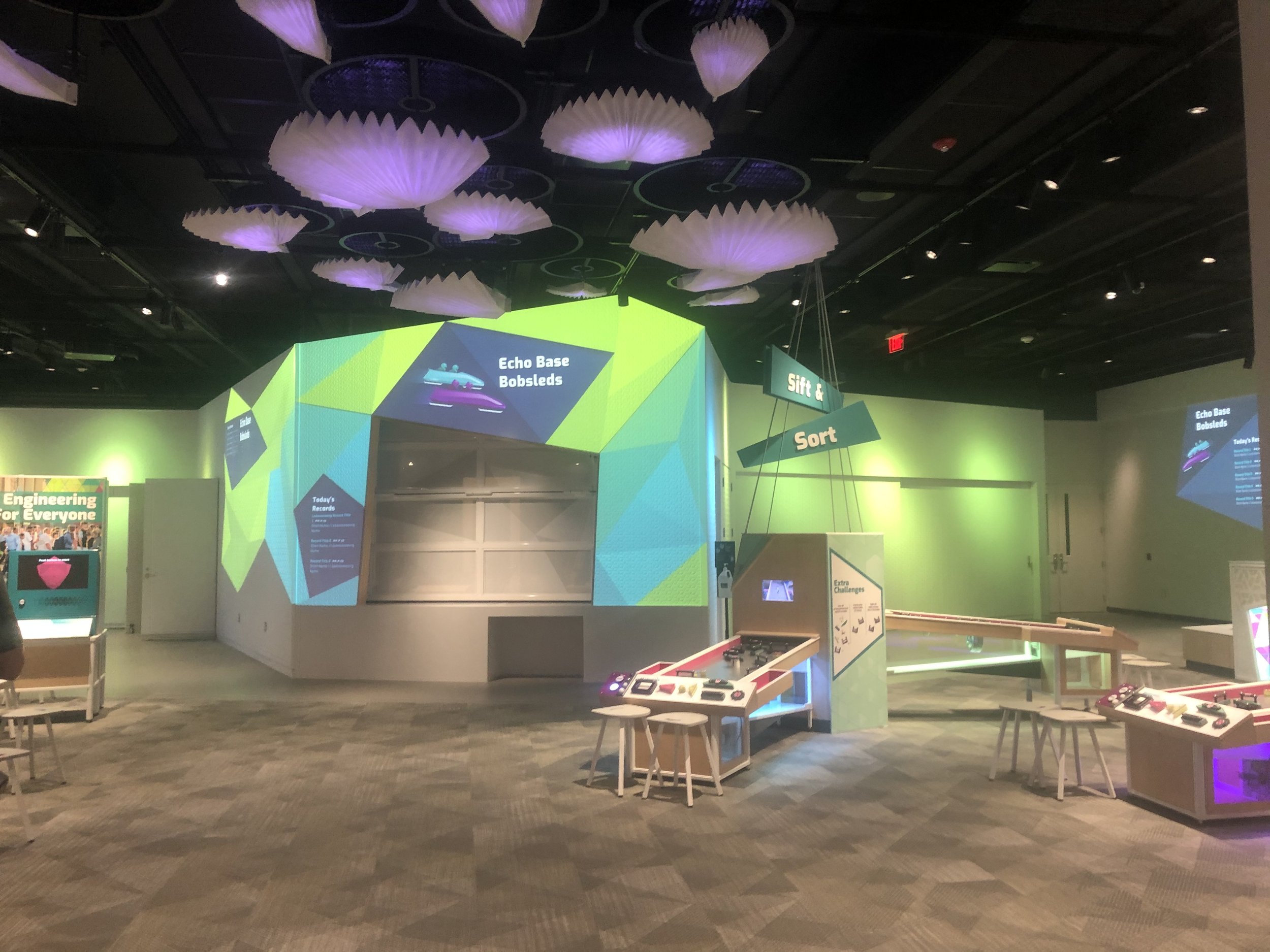
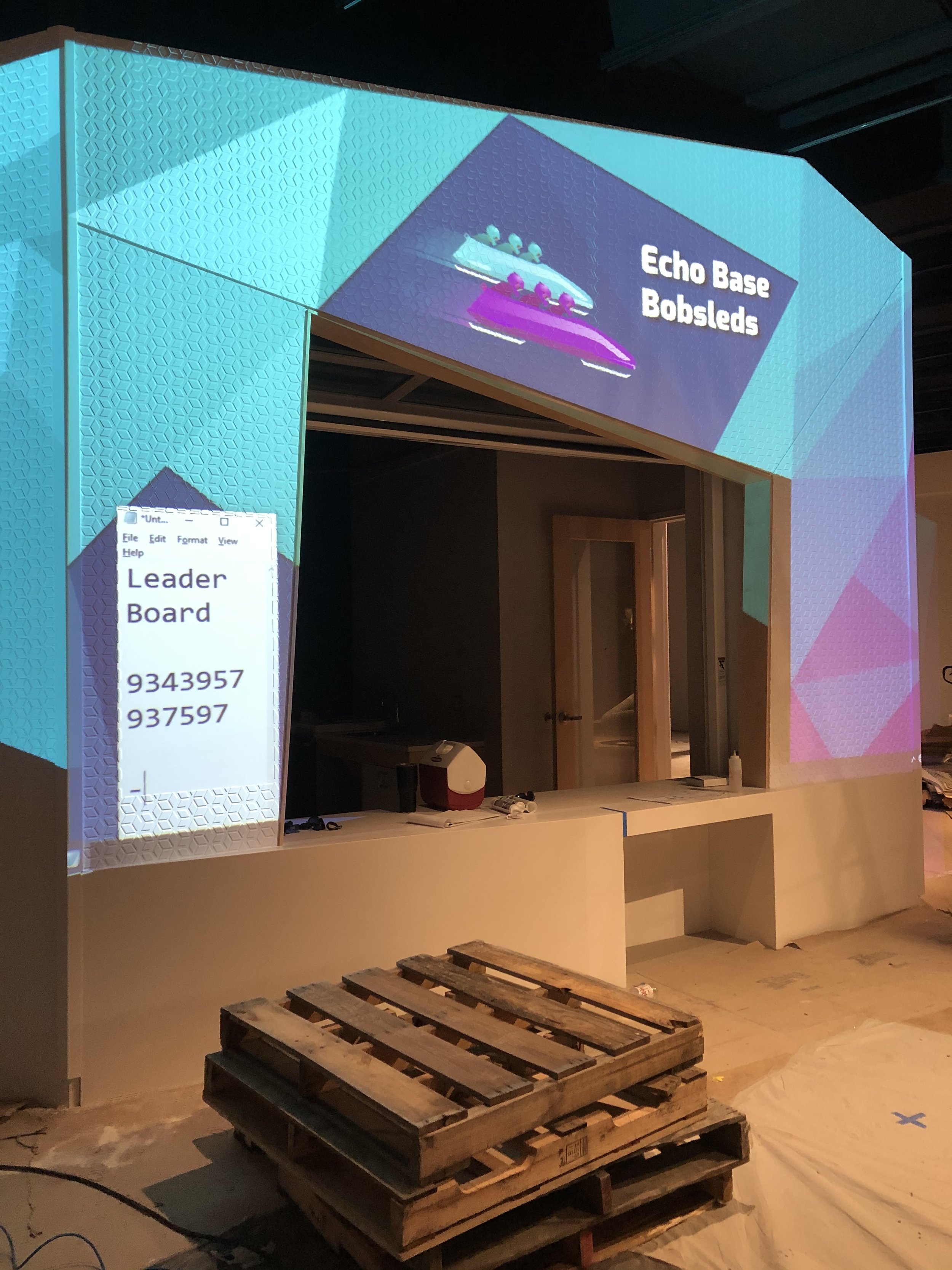
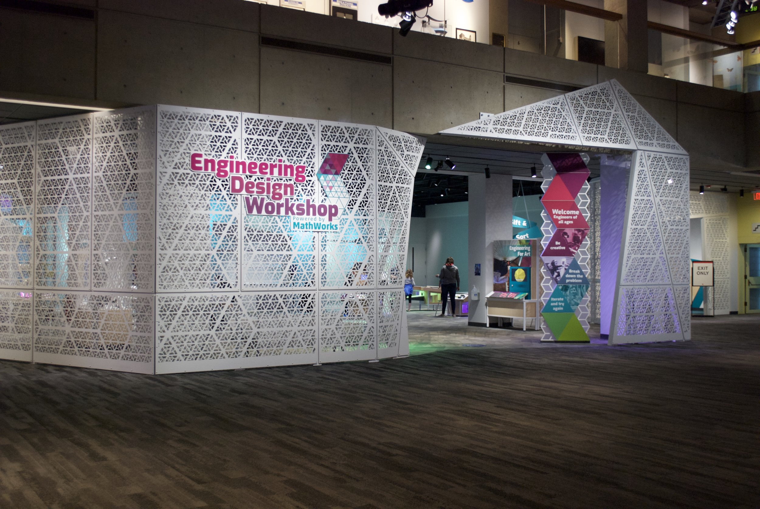
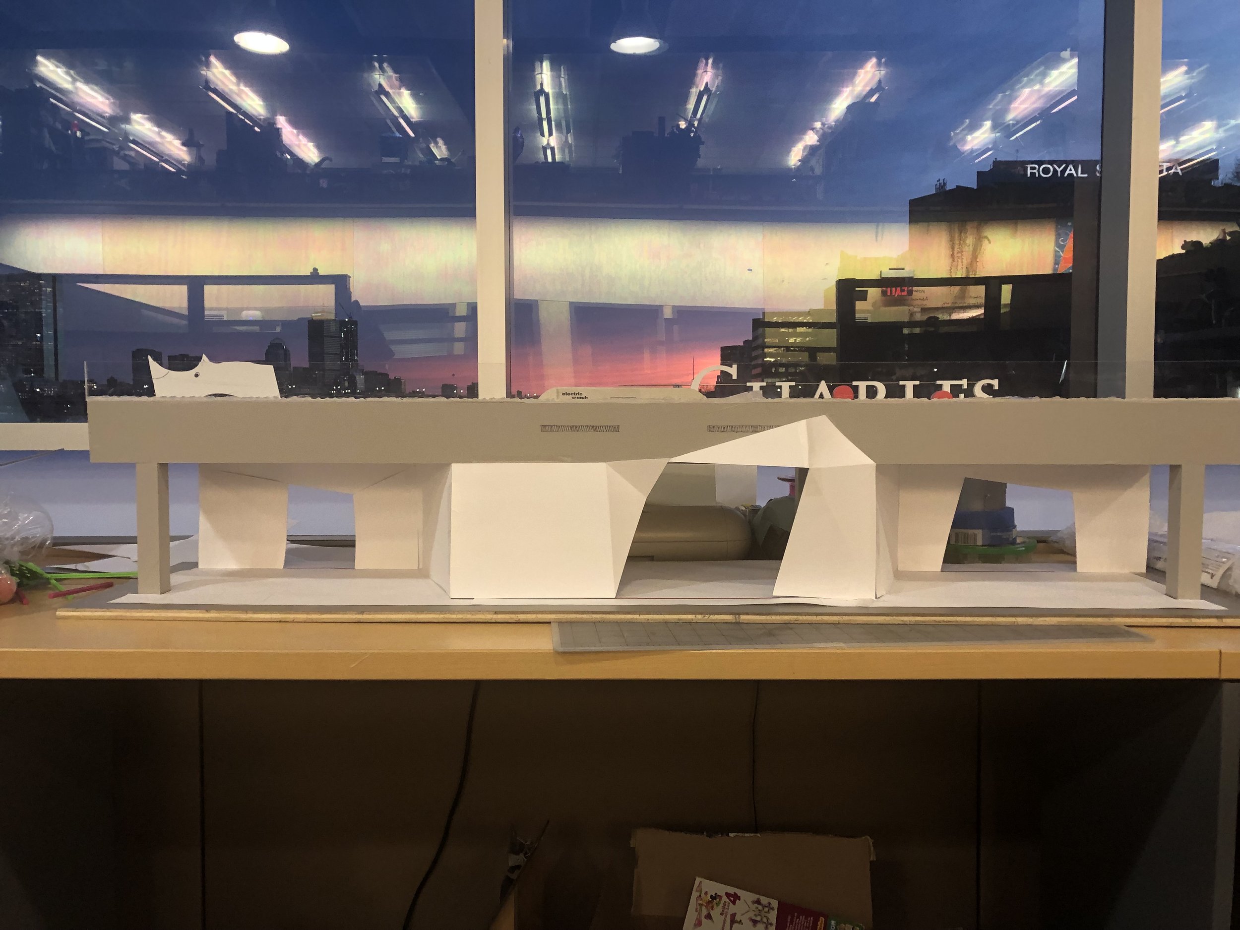
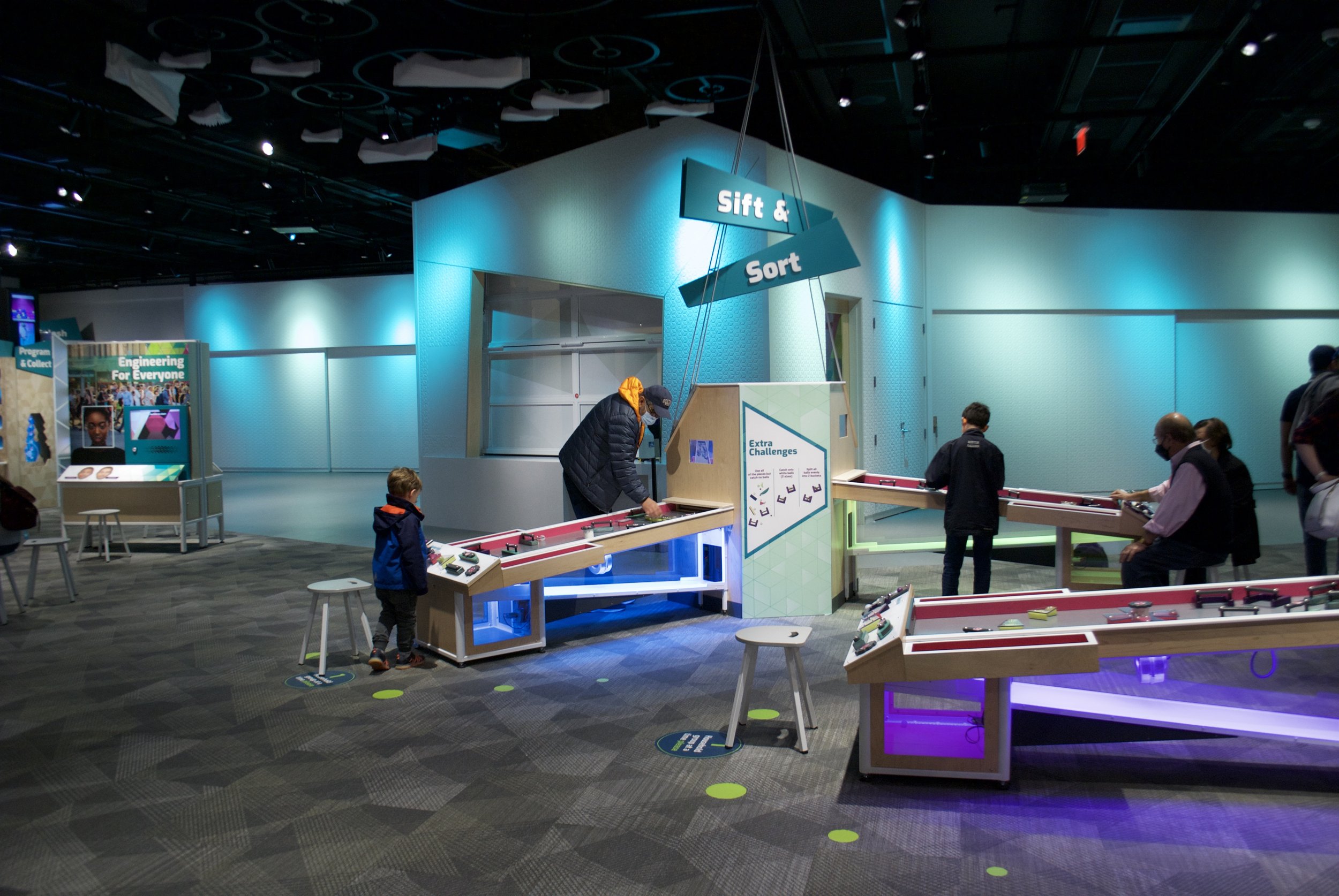
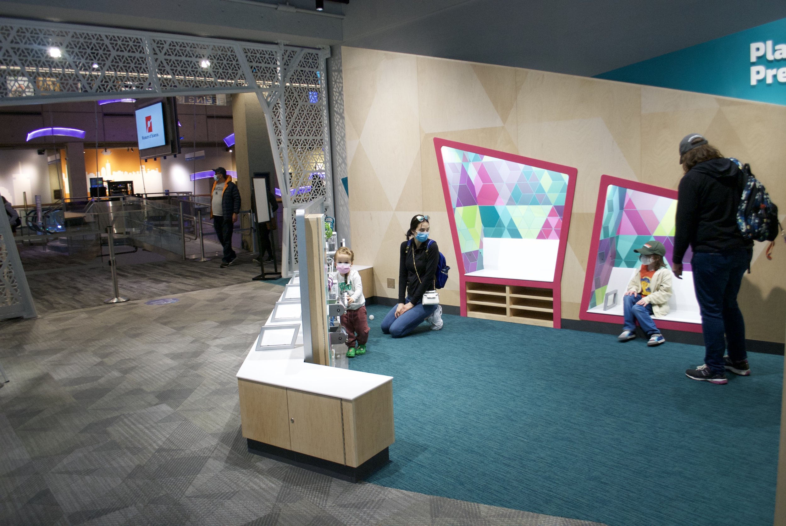
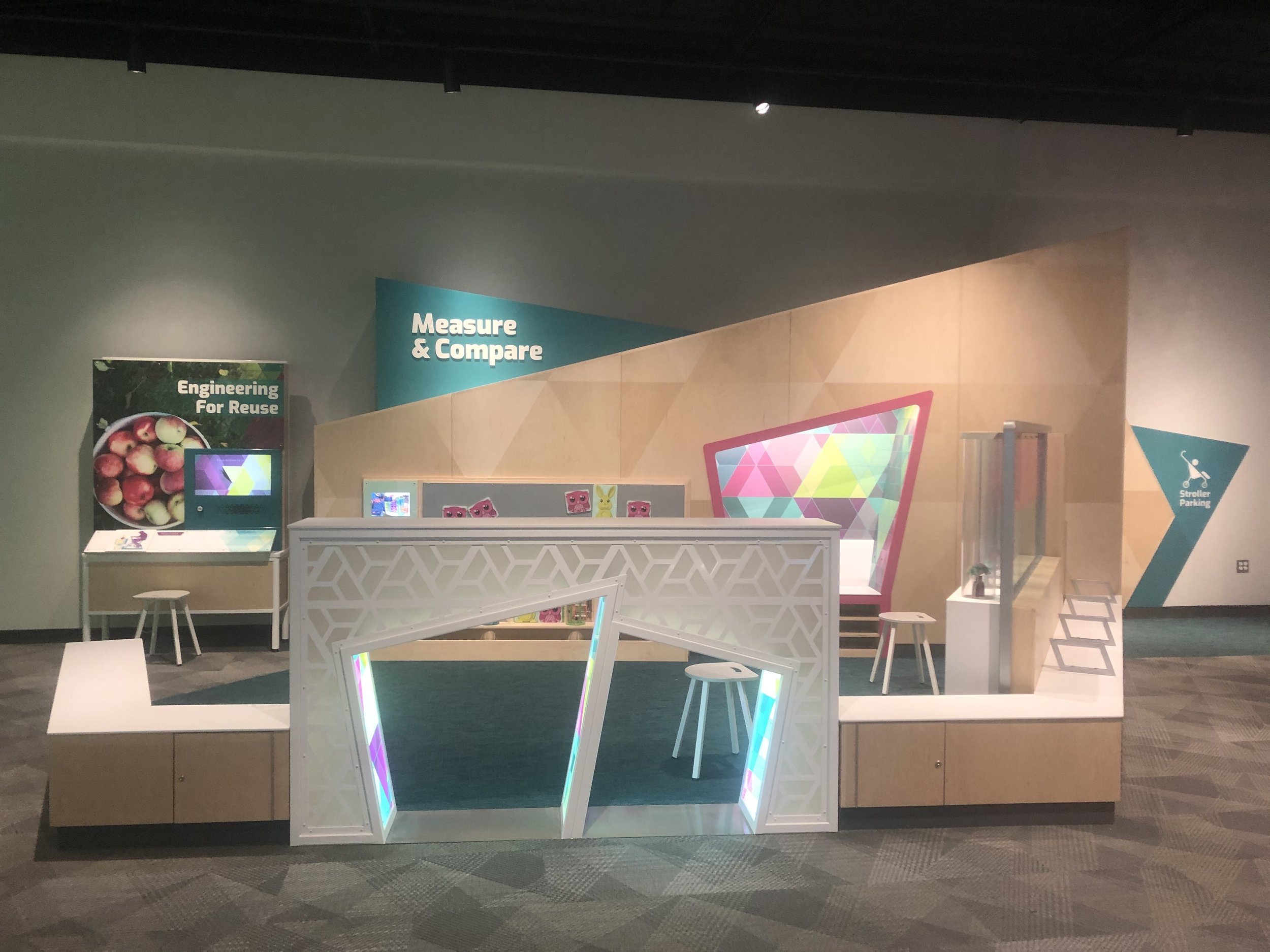
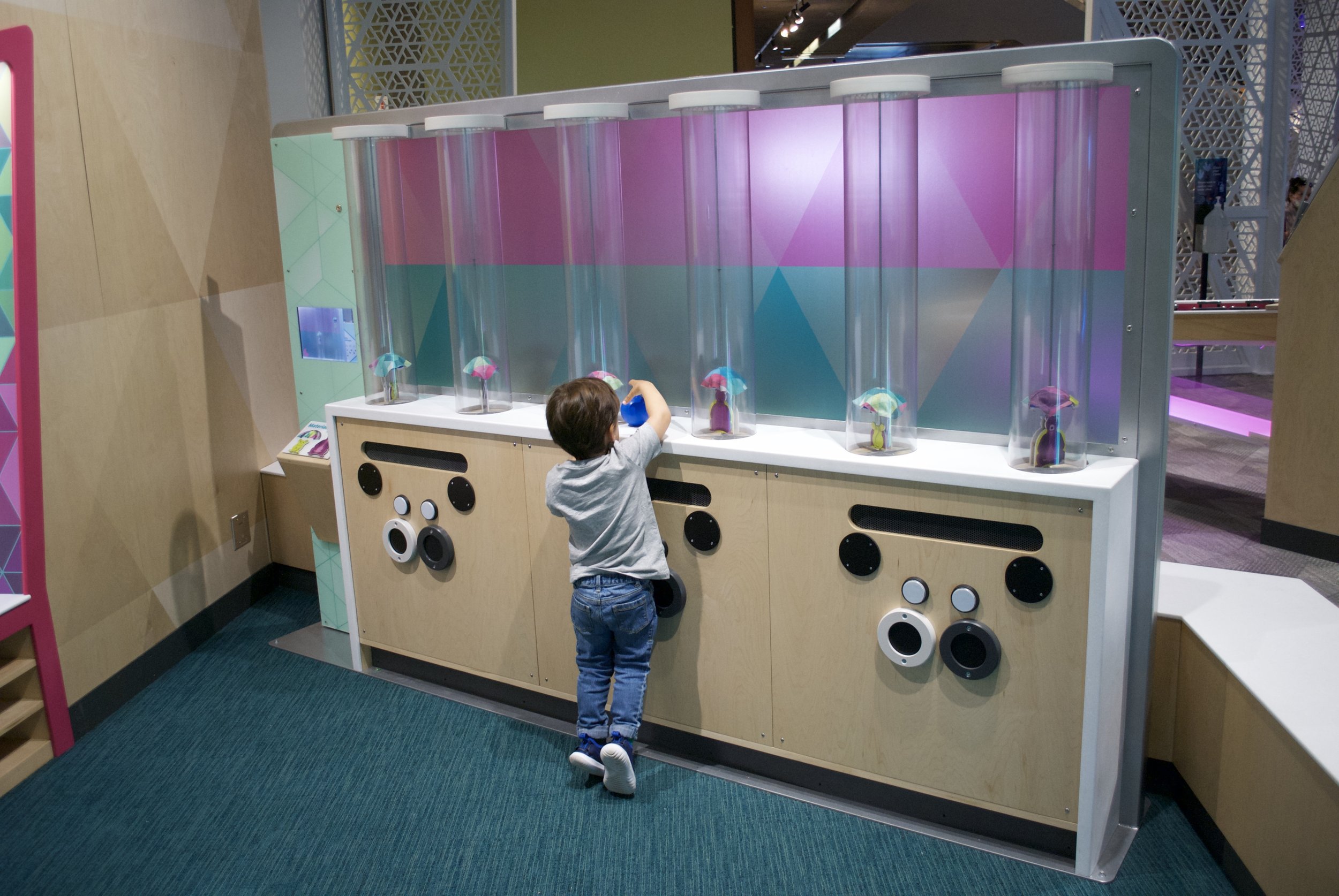
For the general conception of the space, it was important to be welcoming to multi-generational families, young learners, caretakers, and particularly to girls and women. We chose to make it as light and bright as possible, with fun pops of color. We purposefully did NOT want the gallery to feel like a garage or a shed, which often is more cluttered, less polished, and more masculine. We used patterns of triangles at differing scales to create a geometric lace entrance and to add interest to plain materials, like wood and white stone. There are three large projectors that animate the educator space and colored lighting that can change the mood of the gallery instantly. The idea is that everything in the space is art- from the animations to the sculptural furniture to the mechanical fans dancing on the ceiling- and that art is a portal into engineering for some that don’t see themselves as engineers. We added peek-throughs into the mechanics behind the operations at every instance possible to show the engineering behind these interactive moments.

No words
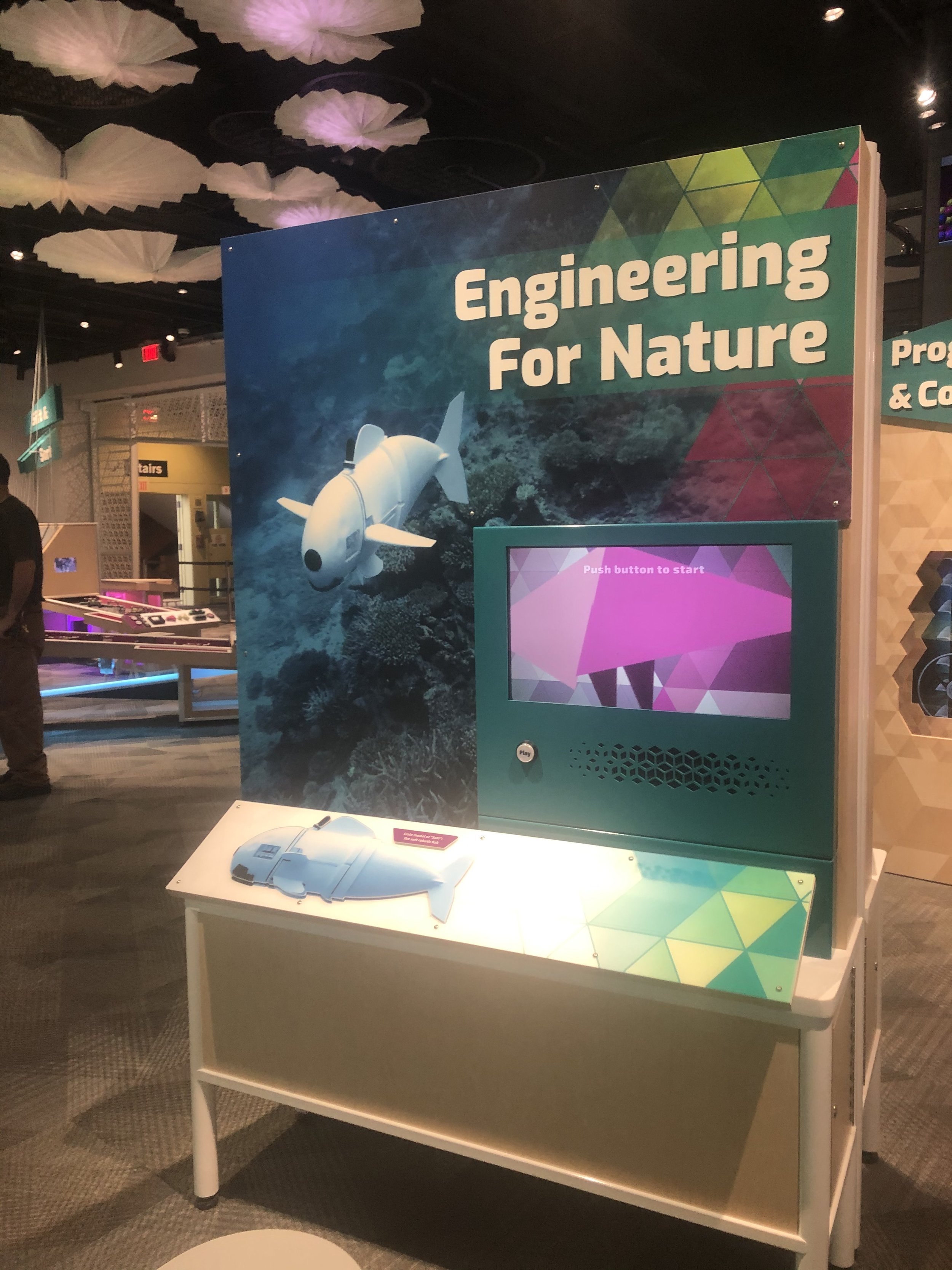
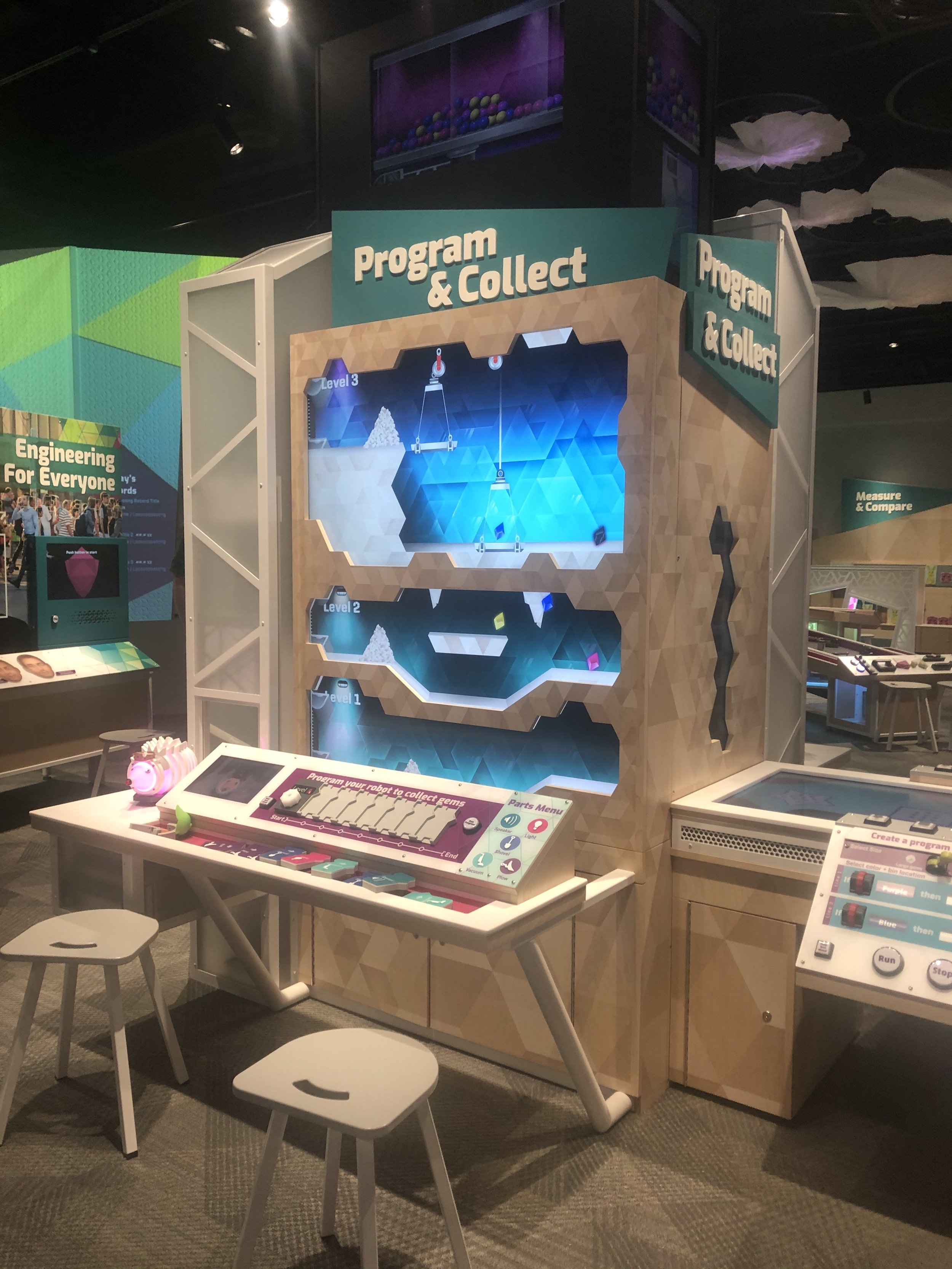
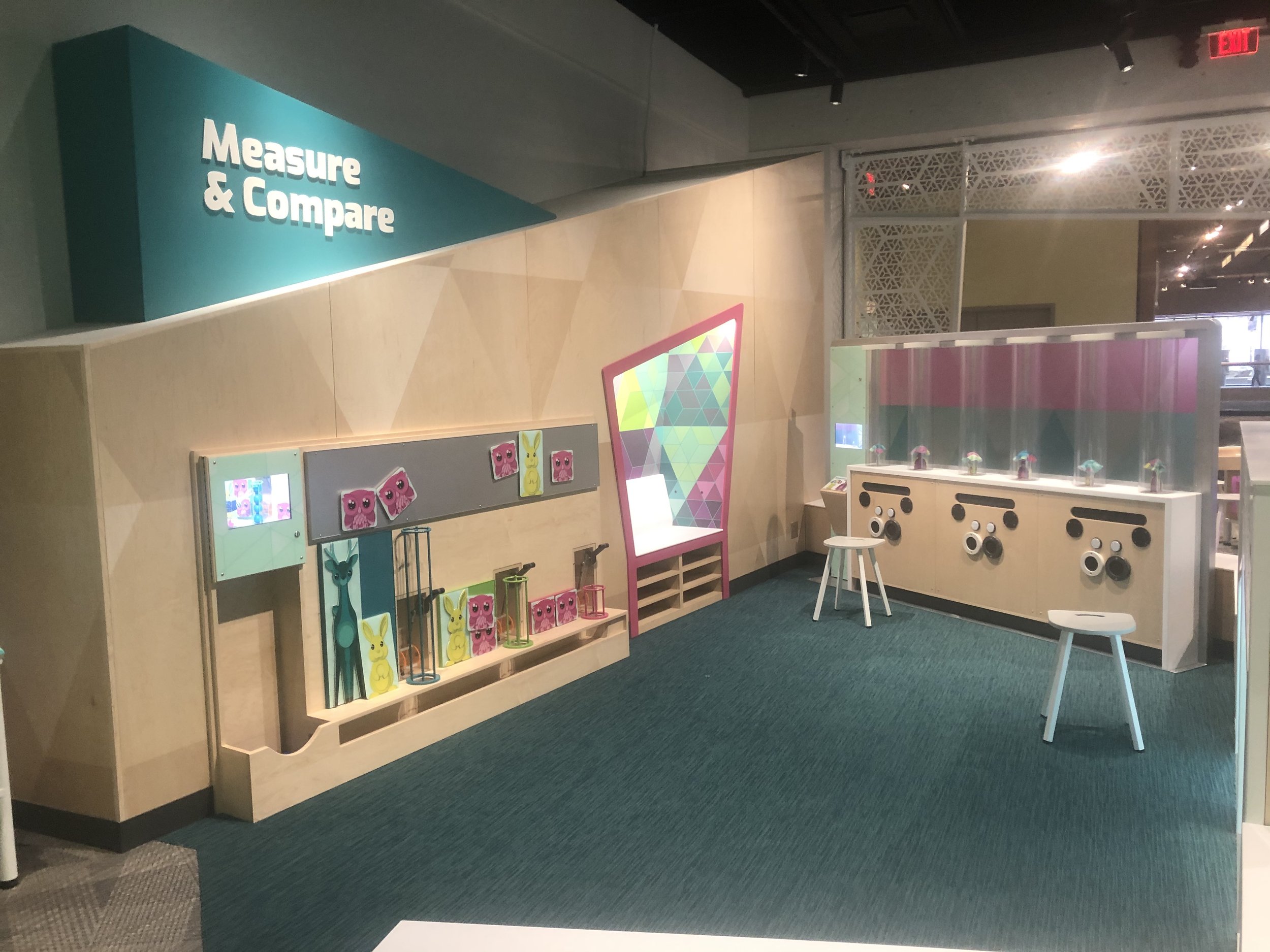
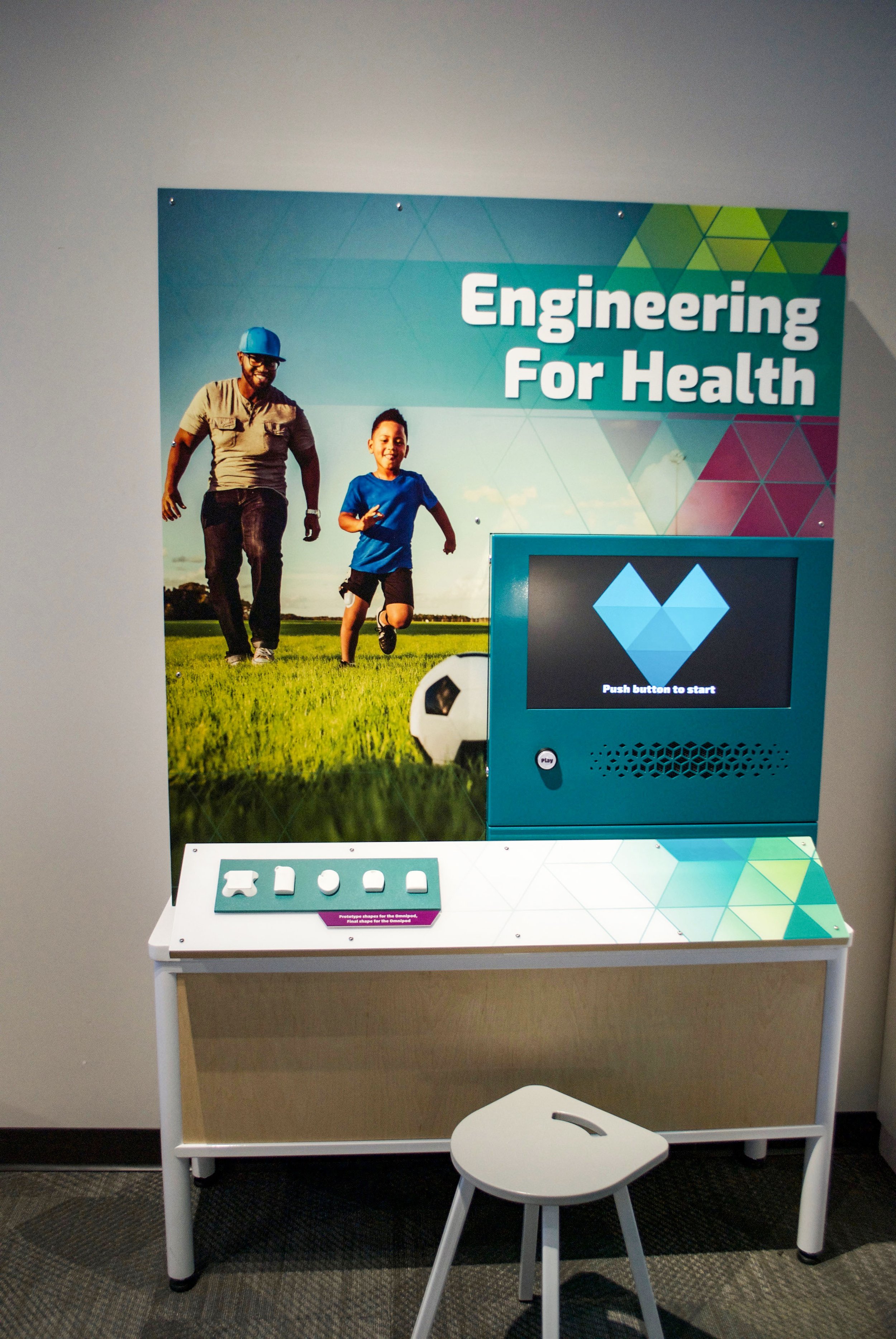
A stretch goal for this gallery was to use no written words. We found this goal pretty much impossible to achieve completely, however, we did succeed in minimizing most words to the title, and button labels in each interaction. We created video labels showing someone using the activity, which were wordless, soundless, and looping. The computer programming activities were more complex, and therefore needed more verbal feedback for visitors to persist through the given challenge.
Universal Design
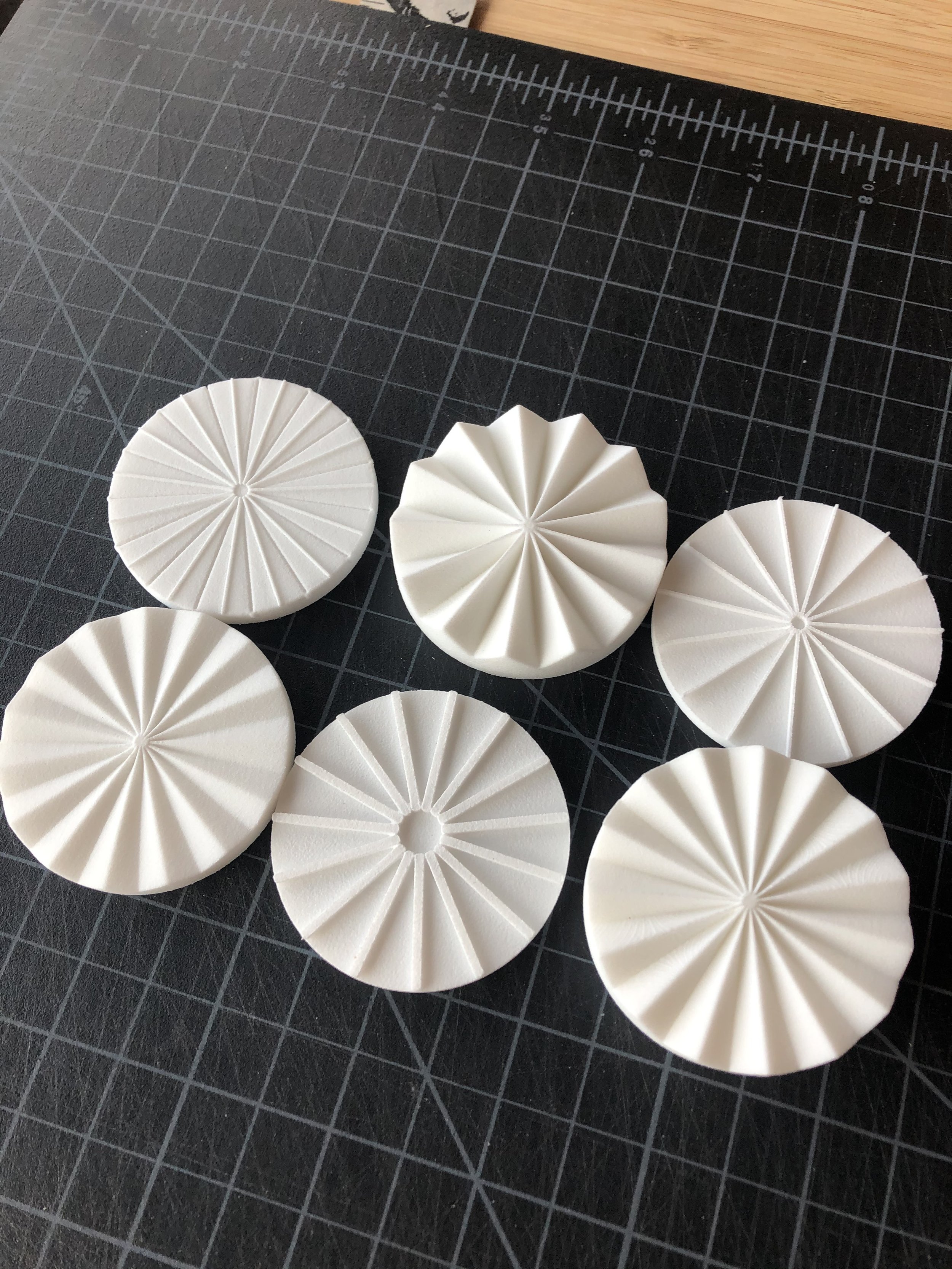
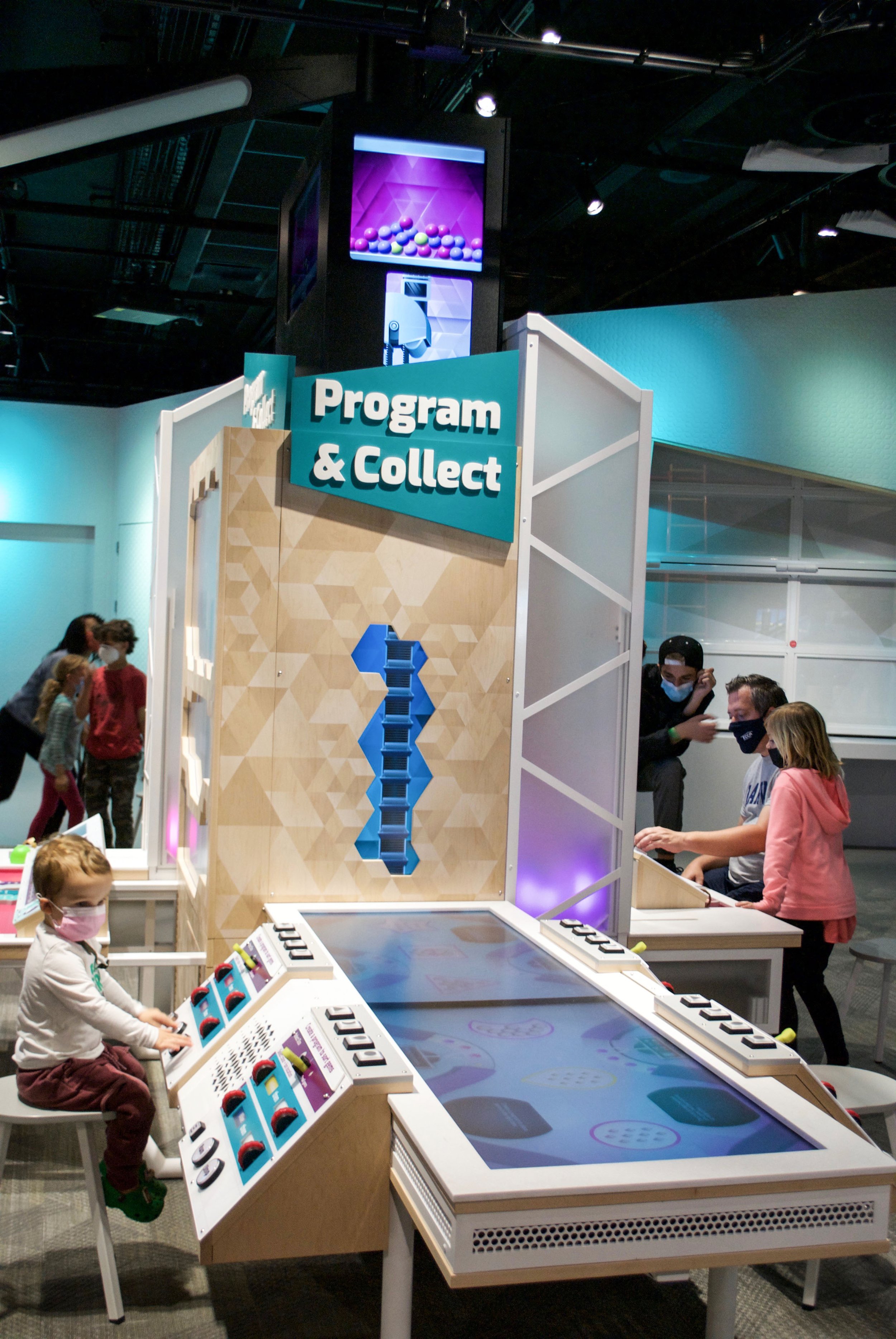
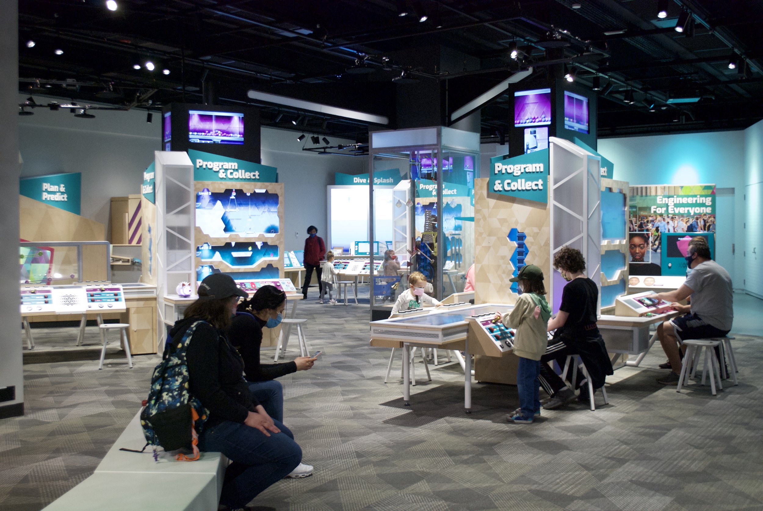
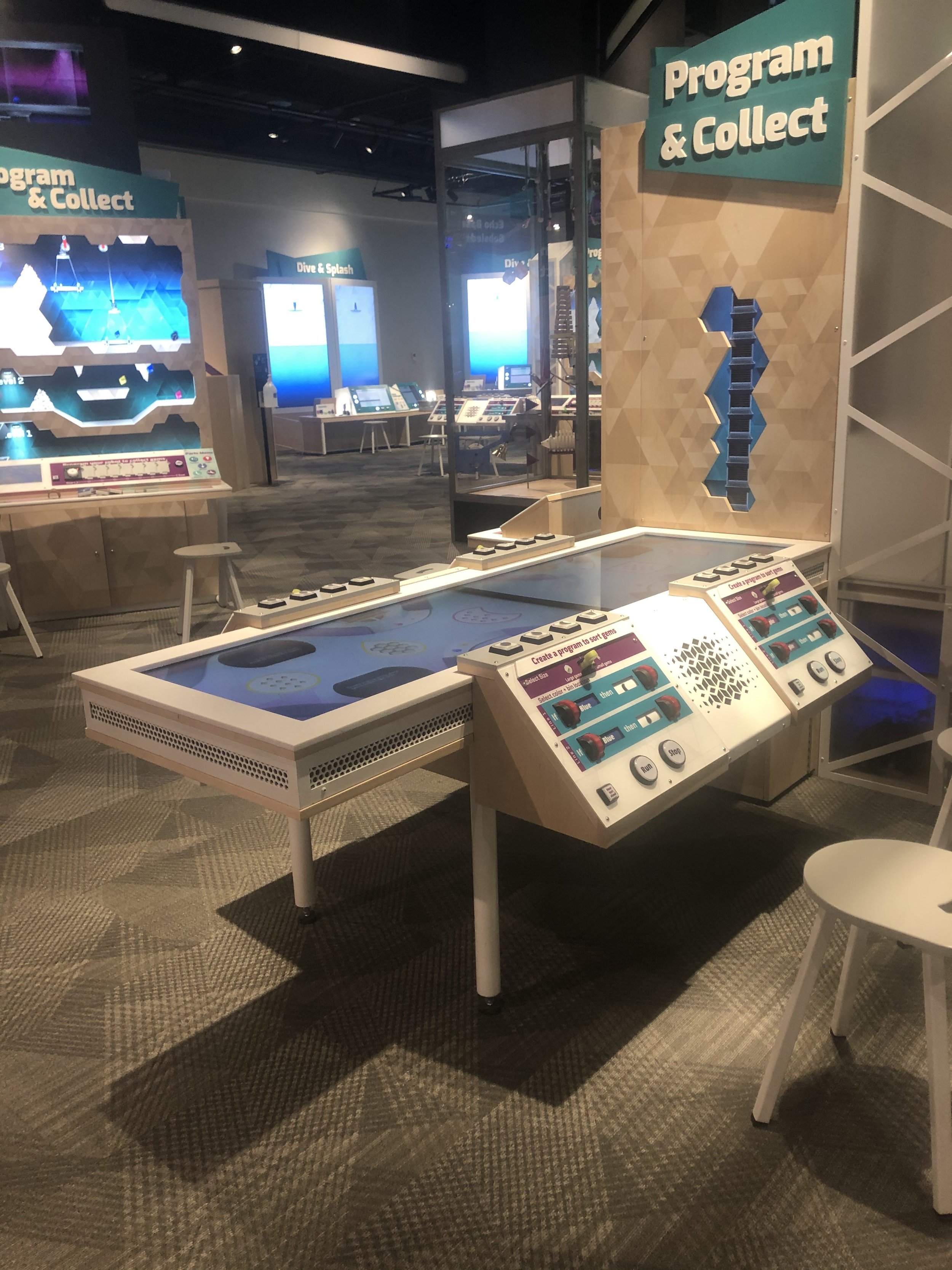
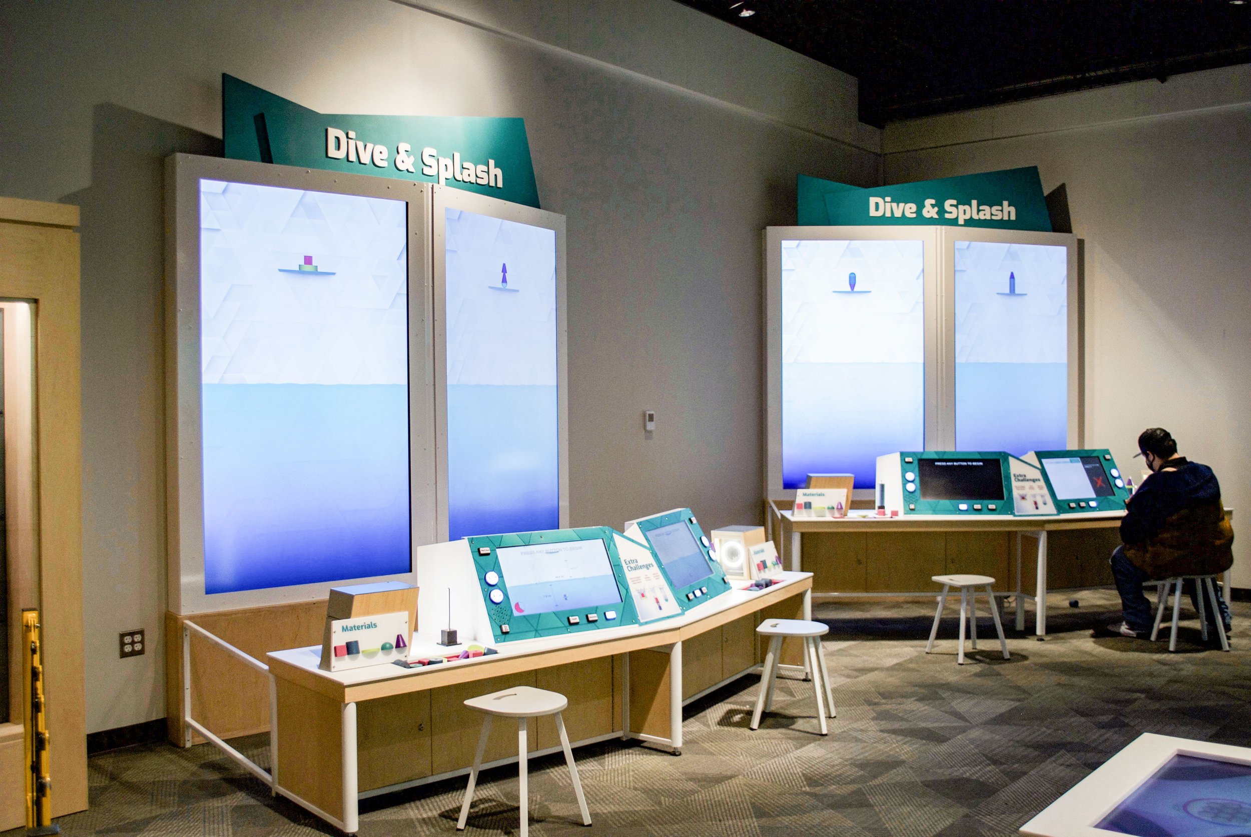
Other universal design tactics we used were including multiple versions of the same activity, at differing heights. We included 3d part menus to illustrate the parts that should be available at your station. We also used localized broadcast audio where needed and relied upon wifi tracking to deliver audio labels to an app on an individual’s personal device.
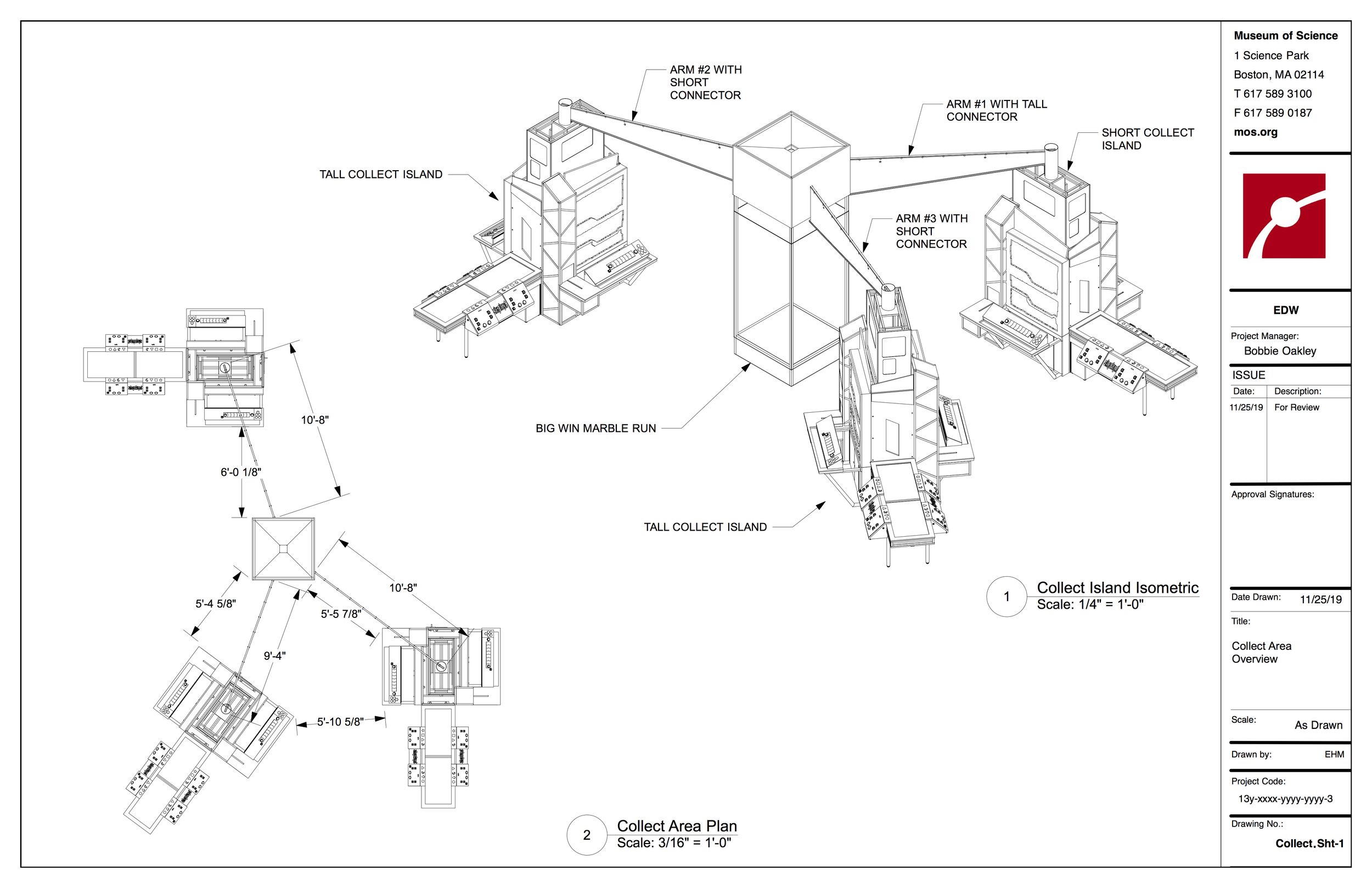
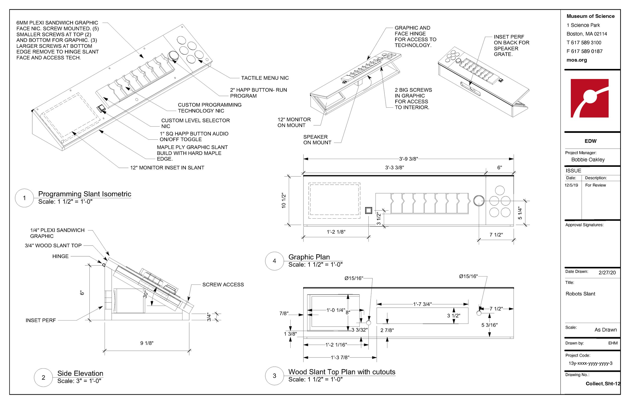
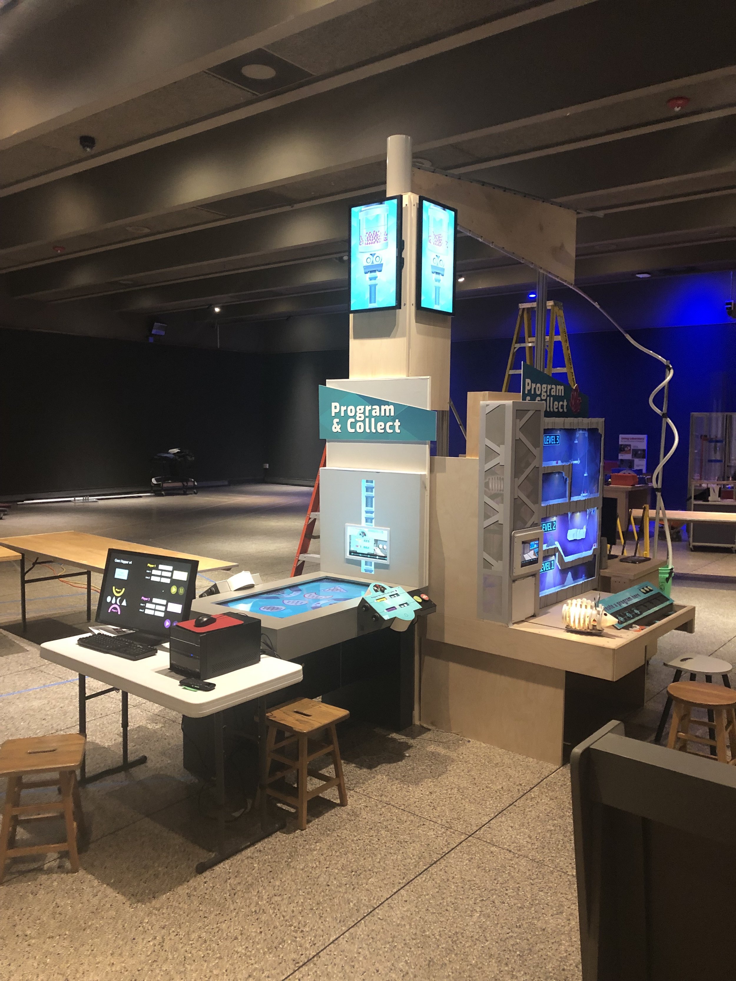
The most difficult designs were our computer programming activities, which we iterated for over 18 months. We ended up creating a system where the visitors goal is to work together to collect gems, in order to activate the central musical sculpture. The activities are universally designed to include physical programming cards and robots who get sent to collect gems in a virtual world of challenges.
